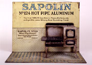
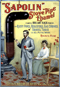
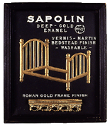
click images to enlarge
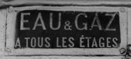
Illustration #1
Eau et Gaz Advertisement, Paris,mid- to late 19th and early 20th century
I was surprised to receive a recent loan request from the Centre Pompidou Museum in Paris for an Eau et Gaz sign from our Art Science Research Laboratory collection here in New York. Eau et Gaz advertisements (see illustration #1) are vestiges from the 19th century Paris, when signs stating “water and gas on every floor” were affixed to the front of buildings to distinguish those premises featuring the modern services that we now take for granted in large cities.
The Pompidou curators realized that their slated exhibition of Marcel Duchamp’s important manuscript notes (mostly written between 1910-’50’s) would be greatly enhanced by including the cultural context that Duchamp drew upon for his early ideas and for related works that followed, even including those which came to light after his death. Duchamp used the “water and gas” theme from the beginning, in his earliest original notes (1911-15) and first selection of these notes for publication (This Quarter, journal 1932) to the cover of his first Catalogue Raisonné (1958) (where he used a faux “readymade” water and gas sign for the boxes of his two deluxe versions), and most significantly, to the largest and last secret work Given 1. the waterfall 2. the illuminating gas, [1944-66], only revealed after he died in 1968. (1)
click to enlarge
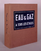
Illustration #2
Marcel Duchamp, deluxe
edition of Robert Lebel’s
Sur Marcel Duchamp, 1958
© 2000 Succession Marcel
Duchamp ARS, N.Y./ADAGP, Paris
Without knowledge about French water and gas signs, now infrequently found on buildings (for all Parisian apartments must be so equipped by law, and landlords need not brag about these services), Duchamp’s major readymade work Eau et Gaz (1958) loses much of its meaning. (See illustration #2 showing Duchamp’s version of a metal sign.)
Alas, despite the fact that our Art Science Research Lab has a nearly complete collection (including documentation of their histories) of the historical objects that Duchamp altered or referred to in his works and writings, we are still looking for an Eau et Gaz sign to replace one that we acquired but that was unfortunately destroyed in shipping. We were therefore unable to fulfill the Pompidou Center’s request.
click to enlarge

Illustration #3D
Marcel Duchamp, Close-up
view of the corkscrew shadow
in Tu m’, 1918
(Note the shadow’s distorted
form in comparison to the actual mass
produced corkscrew found in
the historical record)
© 2000 Succession Marcel
Duchamp ARS, N.Y./ADAGP, Paris.
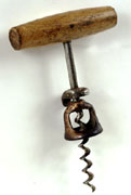
Illustration #3E
Mass produced corkscrew
type that Duchamp likely
used to create his
distorted shadow
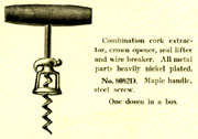
Illustration #3F
Model of a corkscrew from
The Bronson and Townsend Co. catalogue,
1918, shows only one catalogue
source among many to buy the popular
corkscrew design that Duchamp
likely used to create the distorted
shadow in Tu m’, 1918
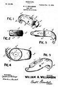
Illustration #3G
Corkscrew patent, Dec, 13,
1898 from the United States
Patent Office for the corkscrew
design Duchamp likely used
as a source for his shadow
alterations.
It is sad for our cultural heritage that art museums have not yet accepted the importance and responsibility of creating special collections as integral and parallel activities to curatorial practice and collecting. In other words, by studying humble and ephemeral historical objects (such as the Paris Eau & Gaz signs).
click to enlarge
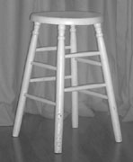
Illustration #3A
Mass-produced old wood stool;
duplicate has been found in
a 1897 Sears Roebuck
catalogue. No stool has
yet been found that matches
the formDuchamp depicts in
his studio photographs and
claimed as mass-produced
and “readymade”.
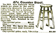
Illustration #3B
Model of a wood stool
from Sears Roebuck catalogue,
1897, illustrates that duplicate
objects can be easily found
in the historical record

Illustration #3C
Marcel Duchamp, studio
photograph, 1917-18,
illustrating a wood stool
not found as mass-produced and
readymade in the historical record.
© 2000 Succession Marcel
Duchamp ARS, N.Y./ADAGP, Paris.
scholars can gain important insights about the cultures and economies that surround the lives of artists and set the contexts of their important works. Is it not ironic that the great Pompidou Museum, with its vast resources and holdings, had to reach out to our small project in America to borrow a distinctively French historic object and, even worse, that we could not provide it for this significant exhibition of Marcel Duchamp, who is now considered the greatest influence upon the last fifty years of 20th century art? (2)
We have initially focused our mission upon the joint collecting of historical objects and reference materials related to Duchamp’s works in combination with our acquisition of the works themselves. This strategy is especially rewarding in this case, given the importance of Duchamp himself and his active utilization of objects and materials from everyday life — objects that are rapidly disappearing not only from our understanding, but also as material and collectible entities.
Our experience has consistently shown us that mass-produced objects from the early 20th century can still be found both as objects and in catalogues. For example, see our wood stool and its 1897 Sears Roebuck source; and a corkscrew, its patent, and a 19th C. catalogue source (in illustrations 3A, B, C, D, E, F and G), Duchamp used and altered both this particular corkscrew’s shadow and a wooden stool, for which we have been collecting general period examples. (The wood stool in 3A duplicates the form shown in the Sears Roebuck catalogue stool in 3B. However, the stool Duchamp used in 3C is still unknown. The corkscrew in 3E, 3F and 3G are the most likely source for Duchamp’s distorted shadow form shown in 3D.) It is indeed strange, and suggestive of Duchamp’s actual artistic practices, that his so-called “readymade” objects, including the 1917 urinal and other alleged mass produced, store bought items, cannot be found in duplicate forms as objects or in commercial catalogues of the period. As time goes on, say in 50 years, the opportunity for readily exploring the historical record and producing such a collection of the objects that then existed (or, in the case of Duchamp, did not exist) may become impossible.
To continue my case for collecting historical objects along with actual art objects, I will discuss seven additional cases illustrating the importance of historical objects to understanding Duchamp’s art works — his famous Fountain urinal (1917); his rectified readymade Sapolin tin paint sign Apolinère Enameled (1916-17); his Hershey postcard note (circa 1915) reproduced in the À’l’infinitif (the White Box [1967]); the red cone on the cover of his Surrealist Intrusion catalogue (1960); his rubber bathing cap sculpture (1918); his glass medical ampule (1919), and finally his Underwood typewriter cover (1916).
1. Duchamp’s Fountain Urinal (1917)
click to enlarge
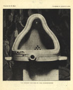
Illustration #4A
Alfred Stieglitz, Photograph
of Fountain The Blind Man
No. 2, 1917 © 2000 Succession
Marcel Duchamp ARS, N.Y./ADAGP, Paris.
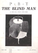
Illustration #4B
Marcel Duchamp, Cover
for The Blind Man No. 2, 1917
© 2000 Succession Marcel
Duchamp ARS, N.Y./ADAGP, Paris.
click to enlarge
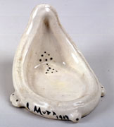
Illustration #5A
Marcel Duchamp, Miniature
of Fountain for the
Boite-en-Valise, 1941
© 2000 Succession Marcel
Duchamp ARS, N.Y./ADAGP, Paris.
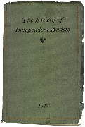
Illustration #5B
Cover for the exhibition
catalogue of The Society
of Independent Artists, 1917
© 2000 Succession Marcel
Duchamp ARS, N.Y./ADAGP, Paris.
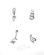
Illustration #5C
Marcel Duchamp, Four
Readymades, 1964
© 2000 Succession Marcel
Duchamp ARS, N.Y./ADAGP, Paris.
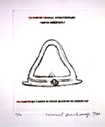
Illustration #5D
Marcel Duchamp, An Original
Revolutionary Faucet: Mirrorical Return,
1964© 2000 Succession Marcel
Duchamp ARS, N.Y./ADAGP, Paris.
Because Duchamp claims that he “lost” this work, the original urinal “readymade” sculpture of 1917 only exists in the form of a photograph taken by Stieglitz right after its famous rejection and ejection before the opening of the 1917 New York Independent Artists Exhibition,(3) (see exhibition catalogue and photograph depicted in Blindman, Issue #2 in illustration 4A,B and 5B). Any 3-dimensional urinals displayed in museums, and said to be by Duchamp and signed R.Mutt 1917, are only later versions beginning with a 1941 miniature for his Boîte-en-Valise portable museum display and includes a 1950 Sidney Janis version (now in the Philadelphia Museum of Art) and a late 1964 series done with Arturo Schwarz in an edition of at least 14 copies. To further add to the confusion, Duchamp states that he purchased his original 1917 urinal at a Mott plumbing store (at a correct New York City address). Yet the shape of his urinal does not match any models found in Mott catalogues or, in fact, in any other plumbing catalogues in 1917, or at any time before or since according to scholars’ investigations of the historical record.(4)
The Art Science Research Laboratory (ASRL) collections includes the Blindman Issue #2 with its Stieglitz photograph of Duchamp’s 1917 Fountain urinal, two copies from among approximately 20 to 25 examples of his signed miniature porcelain urinal that he made for his Boîte-en-Valise (1941); the catalogue from the Society of Independent Artists 1917 exhibition, which rejected R. Mutt’s (a.k.a. Duchamp) Fountain submission, and also, a complete group of the various etchings and studio images where Duchamp includes the urinal (see illustrations 5A, B, C and D). Our rare Mott plumbing catalogues from the time of Duchamp’s Fountain provide an important cultural context for Duchamp’s work, thus permitting scholars to make their own comparisons of the differences between the forms of Mott urinals versus the urinal that Duchamp, within his varied representations, claimed as a “readymade” from the Mott plumbing store.
click to enlarge
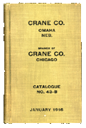
Illustration #6A
Cover for Crane Catalogue, 1916
© 2000 Succession Marcel
Duchamp ARS, N.Y./ADAGP, Paris.
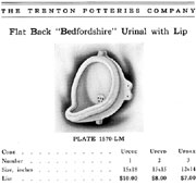
Illustration #6B
Model of a urinal from
The Trenton Potteries
Company catalogue, 1913,
p. 355
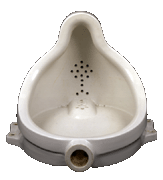
Illustration #6C
1916 Crane Bedfordshire
urinal, stamped Trenton
Potteries on back
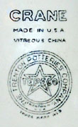
Illustration #6D
Close-up view of the stamp
The historical record reveals that Mott did not manufacture urinals but only sold them under their own label in 1917, as did Crane and other plumbing companies. Trenton Potteries, located in Trenton, New Jersey (the porcelain plumbing manufacturing center of the U.S. at the beginning of the 20th century), made urinals for both Mott and Crane. Trenton Potteries catalogues, also in our collection, show that Mott, Crane and other distributors (within their exclusive manufacturing arrangement) had a limited choice of standardized urinals — and none are shaped like the one depicted in the Stieglitz 1917 photograph in Blindman #2. (note illustration 6A from our collection’s 1916 Crane catalog). The Bedfordshire model (illustration 6B) that Varnedoe and Camfield discuss is the most similar, but is not identical, to Duchamp’s 1917 urinal. This model is also consistently depicted in the Trenton Potteries, Mott and Crane catalogues. Our collection has also acquired three identical Crane Bedfordshire urinals (stamped Crane, Trenton Potteries, see illustration 6C and D) for scholars to examine. (5)
2. Duchamp’stin Sapolin paint sign Apolinère Enameled (1916-17)
click to enlarge
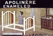
Illustration #7A
Marcel Duchamp, Apolinère
Enameled, 1916-17
© 2000 Succession Marcel
Duchamp ARS, N.Y./ADAGP, Paris.
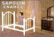
Illustration #7B
Computer simulation showing
how Sapolin sign appeared before Duchamp
added black paint and made changes to letters
Allegedly, Duchamp only slightly altered a 1916-17 Sapolin paint sign to honor his friend, the poet Apollinaire. (Duchamp said that he merely blacked out the “S” of Sapolin, and added ère to the end, and then added ed to “Enamel,” resulting in “Apolinère Enameled.” — implying that he did nothing more. Similarly Duchamp, via additions and eliminations, changed the original inscription at bottom right: “manufactured by Gerstendorfer Bros.” to “Any Act Red by Her Ten or Epergne”). However, Stephen Jay Gould and I went to the Philadelphia Museum of Art’s conservation department to request further analysis to determine the extent and quality of Duchamp’s manipulation of this sign. Examination by conservators (with ultra violet light, for example) revealed that the black paint at the top and bottom of the sign (containing the letter changes, see illustration 7A) was added by Duchamp and that the letters actually “floated” upon the room (see illustration 7B which approximates what would be seen under Duchamp’s alterations (6). According to conservators, no other letter or text is evident. Duchamp’s sign, when judged within context of our extensive Sapolin sign and ephemera collection (with hundreds of items, from the 1890’s to the 1940’s), is quite anomalous because Sapolin signs, in almost every case, include product numbers and sales pitches. (7)
click to enlarge
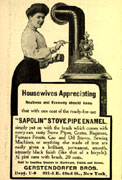
Illustration #8E
Sapolin stove pipe
enamel advertisement
in their campaign
aimed at women
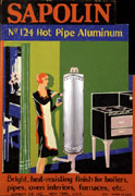
Illustration #8F
Sapolin N. 124 hot
pipe aluminum advertisement
in Art Deco Style
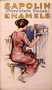
Illustration #8G
Cover page for the
Sapolin Enamels brochure
click to enlarge
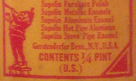
Illustration #8A
Note paint can indicates
Gerstendorfer Bros.
makes Sapolin paint
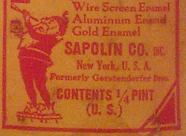
Illustration #8B
Note paint can indicates
“Formerly Gerstendorfer
Bros” and uses the
Sapolin trademark as the
company name to
avoid German prejudice
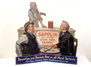
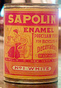
Illustration #8C
Large cardboard sign
depicts two men playing
dominoes and uses Victorian
nostalgia theme from
the early 20th century
Illustration #8D
Sapolin paint in lady sized 1/4 pint can
Just as the Mott urinal research led us to one of the early cases of anti-trust and unfair trade practices (as the plumbing potteries industry “society” in Trenton, New Jersey fixed prices and frequently restricted trade by officially selling only to licensed plumbers and not to the public), Sapolin paint research directed our attention to a firm that began as a late 19th century immigrant German gilding company, Gerstendorfer Brothers, which, by 1902, had quickly expanded to include the speciality of the trademarked Sapolin metal paint. Their adaptation to changing American sentiments toward Germans can be seen in their signs, point of purchase displays, brochures and promotional giveaway items. As of WW1, they were using their trademark name Sapolin as their company name instead of Gerstendorfer Brothers to mitigate anti-German prejudice caused by the war. The collection of Sapolin signs also illustrates trends in advertising, such as a Victorian nostalgia revival and the new look of Art Deco. At that time, the company itself took a bold, new and controversial initiative, creating products and a focused ad campaign aimed toward women (not men!) for painting in the home. Illustrations 8A, B, C, D, E, F, and G show name changes from Gerstendorfer to Sapolin, adoption of changing stylistic trends over time and images of dainty woman-sized Sapolin paint cans, signs and ads in their [controversial] campaign to sell paint to women. All these objects are in the ASRL collection.
click to enlarge
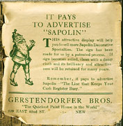
Illustration #9A
First example of
back label naming
Gerstendorfer Bros.
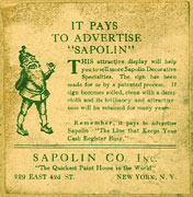
Illustration #9C
Second example of
back label naming Sapolin Co.
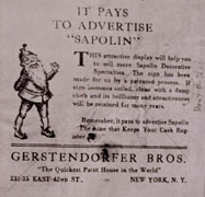
Illustration #9E
Marcel Duchamp’s version
of back label for
Apolinère Enameled Schwarz’s
edition, #5/8, 1965
Note this label only
matches Duchamp’s other version
and not the original labels
© 2000 Succession Marcel
Duchamp ARS, N.Y./ADAGP, Paris.
click to enlarge
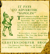
Illustration #9B
Third example of original
back label naming
Gerstendorfer Bros using
the same address as
Duchamp’s version below
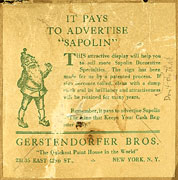
Illustration #9D
Marcel Duchamp’s version
of the Gerstendorfer
Bros, back label on
Apolinère Enameled,
1916-17. Note the distorted
text in the second
paragraph when compared
to the actual historical
label shown above.
© 2000 Succession Marcel
Duchamp ARS, N.Y./ADAGP, Paris.
Of particular relevance to Duchamp scholars are the alterations that he made to the label on the back of his 1916-17 Apolinère Enameled sign, also included on the back of his 1965 Schwarz reproduction. We have one of the edition of 14 in our ASRL collection. As with the urinal, Duchamp created a series of different versions of his Apolinère Enameled throughout his life, including a 1941 version in his Boîte-en-Valise. Only in the original and in the 1941 versions does Duchamp use a back label and write “Don’t do that” next to printed instructions “wipe with damp cloth.” (8) Our collection offers scholars the opportunity to compare Duchamp’s label to the labels in the collection, moving through time from Gerstendorfer Brothers at two addresses (one matching the address in Duchamp’s label) to a later label with the change to Sapolin Company at a still different address. The label’s basic text and design remains the same in all the official Sapolin labels (see illustration 9A, B, and C). However, in Duchamp’s label in both his original 1916-17 and his 1965 Schwarz edition versions (see illustration 9D and E), the word “register” on the bottom line is strangely out of register in comparison to the complete stability of the Sapolin labels in our collection, and which span a long range of time. Only by examining our set of these standard labels can a context be established to determine that Duchamp probably tampered in a subtle way with the standard readymade Sapolin label.
click images to enlarge
- Illustration#10A
- Illustration#10b
- Illustration#10c
- Sapolin No. 124 Hot
Pipe Aluminum advertisement
with 3-D Stove on
2-D tin sign - Sapolin Stove Pipe Enamel
advertisement uses 2D
tin sign and a slightly
raised, (in-between 2D
and 3D) tin pipe - Sapolin No. 123 Deep-Gold
Enamel advertisement with
a slightly raised,
(in-between 2D and 3D)
metal bed
click to enlarge
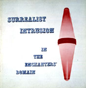
Illustration #11A
Marcel Duchamp, Cover
for Surrealist Intrusion
in the Enchanters’ Domain,
1960, with embossed,
(slightly raised surface)
tobaccoist sign.
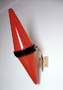
Illustration #11B
Late 19th, early 20th
C French tobaccoist sign
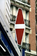
Illustration #11C
Modern two-dimensional
neon tobaccoist sign
3. Red cone on cover of the Surrealist Intrusion catalogue (1960)
Duchamp’s design for the 1960 exhibition of Surrealist Intrusion in the Enchanters Domain (see illustration 11A) includes a red cone object that, even in modern day France, is fast disappearing from Paris streets (and is, in any case, completely unknown here in America).
click to enlarge
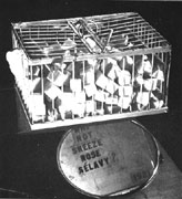
Illustration #12A
A Man Ray photograph
of Marcel Duchamp’s Why
Not Sneeze Rose Sélavy?

Illustration #12B
Marcel Duchamp’s miniature
reproduction of Why Not
Sneeze Rose Sélavy?
in the Boite-en-Valise,
1941 A 2D photograph is
cut and applied
to a 3D plaster form which
traps this work in-between
2 and 3D Dimensions
Tobacco shops in France today use modern neon 2-dimensional versions of this traditional guild symbol for a tobacco shop (see examples in illustrations 11B and C). An important geometric theme in Duchamp’s notes (1911-15), and within his works, is the transition between 2 and 3 dimensions — illustrated here by the 2-dimensional red cone (embossed into a slight 3-D relief) and its relation to its 3-D form of the original red cone sign. In 1960, Duchamp would already have seen the reduction of this 3-D guild sign to 2-D neon (as shown in illustration 11C) as a social translation of what he was geometrically creating for his 2-dimensional (albeit slightly 3-D due to its embossed texture) Surrealist cover.
Our red glass tobacconist sign, in connection with a copy of this important Surrealist catalogue and Duchamp’s mathematical notes on the subject (in the White Box Notes, 1967, also included in our collection), and his other uses of similar 2-D to 3-D in-between transitions, show scholars a larger cultural, as well as an interdisciplinary geometric, context when examining Duchamp’s humble Surrealist cover design (see, for further examples, his 2-D photograph [1941] of his 3-D bird cage [1919] mounted on a 3-D plaster mount in his Boîte-en-Valise (1941) that traps between 2 and 3 dimensions [see illustration A and B] and numerous similar examples within Sapolin signs and ephemera such as a 3-D radiator shown in a tin sign as more than 2-D but less than 3 in comparison with Sapolin 3-D radiator giveaway novelty item. [see illustration 13A and B]
click to enlarge
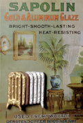
Illustration #13A
Sapolin Gold &
Aluminum Glaze 2-D
tin sign with slightly
raised, 3-D radiator.
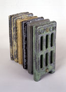
Illustration #13B
Sapolin 3-dimensional
radiator novelty item
click to enlarge
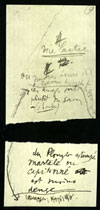
Illustration #14A
Marcel Duchamp, reproduction
of the 1915 original in the
White Box Notes, 1967 (verso)
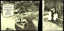
Illustration #14B
Marcel Duchamp, reproduction
of the 1915 original
in the White Box Notes,
1967 (recto). Note upper left 3D Hershey
bar changing into a
2D sign below
4. Duchamp’s
Hershey Postcard note (circa 1915)
Duchamp reproduced his postcard note from the 1910’s in his White Box Notes (1967). Both Duchamp’s original Hershey postcard and his reproductions were torn in half (see illustration 14A and B) and had text written on the back. (10)Duchamp’s interest in 2-D to 3-D dimensional changes is also illustrated by this postcard’s symbol in the upper left hand corner (see illustration 14B and 15A). A 3-D Hershey bar is typically depicted in transition, metamorphosing into a 2-D form on many versions of Hershey postcards.
Illustrations 15A and B show an identical Hershey postcard to the one Duchamp used before tearing, and an original candy wrapper (circa 1910’s). Around the time Duchamp first arrived in New York, in 1915, he was not yet well known for his lifelong love of chocolate and use of the theme throughout his works. We know from the Hershey postcards themselves that he must, soon after arriving in the US, have bought a Hershey bar with an enclosed postcard like the one illustrated in 15A. The Hershey Chocolate Company had a successful campaign for a collectible series of approximately 88 varieties of cards, issued as inserts in Hershey candy bars between 1909 and 1918. The campaign aimed to promote the idyllic town of Hershey, Pennsylvania, the home of Hershey chocolate. Amusingly, as an unintended consequence, numerous requests arrived from male buyers to meet and even to marry the nubile young Hershey girls depicted on the cards. (Allegedly, some marriages actually took place!) Several cards, including the one that Duchamp found and reproduced as his note, were so popular that a series of two additional, regular sized postcards were made. (see illustration 15C.) These two and others are in the ASRL collection. (With one card in green tones, and the two others done over time with small changes in size and color, the Hershey series resembled the series of Duchamp’s themes such as urinals, Sapolin signs, etc., with alterations executed over time by Duchamp himself.)
click to enlarge

Illustration #15A
Original Hershey
postcard like the one
that Duchamp purchased, 1910’s
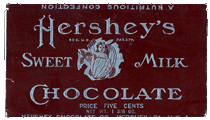
Illustration #15B
Original Hershey
chocolate wrapper
that held postcards, 1910’s
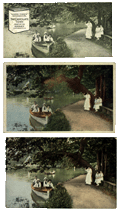
Illustration #15C
Three Hershey post
cards done in a series
5. Duchamp’s Underwood typewriter cover (1916)
click to enlarge
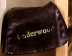
Illustration #16A
Marcel Duchamp, miniature
version of Traveler’s Folding
Item in his Boite-en-Valise, 1941
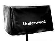
Illustration #16B
Marcel Duchamp, Traveler’s
Folding Item, Schwarz
edition, 1964
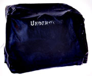
Illustration #16C
Rare, original Underwood
typewriter cover ca 1915
One of Duchamp’s strangest readymades has to be his Underwood typewriter cover (1916). The first time that we see either an object or a depiction of this alleged readymade is in 1941, when Duchamp created a miniature version for his Boîte-en-Valise (see illustration 16A). Duchamp’s only other extant version was created late in his 1964 Schwarz edition — twelve copies of a full scale Underwood typewriter cover that looks, and is sized, more more like the cover for a barbeque grill than for a vintage typewriter (see illustration 16B). No photograph, or any other type of 2-D or 3-D representation, exists of Duchamp’s readymade rubber Underwood cover (1916).
Finding a circa 1916 typewriter (as indicated by dating serial numbers of Underwood #5 models) was easy. But we encountered quite a problem in trying to find an intact rubber cover from the same period. Collectors or museums either did not think it important to save them, or the covers themselves had been discarded because of deterioration. I was lucky to find our rare, near perfect example. Calls to experts and museums throughout the country led to a collector who, to our good fortune, had bought an Underwood #5 with the correct serial number (from circa 1916) that had never been opened or removed from its original wooden crate. Happily, he was willing to sell us the rubber cover for our collection. (see illustration #16C)
click to enlarge
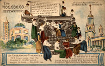
Illustration fon #17A
Postcard depicting Giant
Underwood typewriter
(1728 times larger
than the standard
Underwood Model), 1915
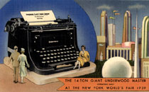
Illustration #17B
Postcard of the
14-ton Underwood
Master At The New
York World’s
Fair, 1939
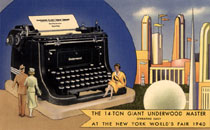
Illustration #17C
Postcard of the
14-ton Underwood
Master At The New
York World’s
Fair, 1940
Duchamp’s first version of his Underwood cover in 1941 probably relates to a highly popular 14 ton giant Underwood typewriter, (11) which was first displayed in the 1915 Pan American Exhibition and later in 1915 in Atlantic City, New Jersey as a permanent exhibition until it was reconditioned and updated for display at the 1939-40 World’s Fair in New York. Note the beautiful girls sitting on typewriter keys depicted on both Pan American (1915) and World’s Fair postcards (1939-40) in illustrations 17A, B, and C. What a crazy country, Duchamp perhaps thought — where you can find beautiful girls to marry in chocolate bars and watch them dance on giant working typewriters!(12) Illustration 18A shows Duchamp’s 1941 miniature typewriter cover with a miniature model of the 14 ton giant typewriter that worked as a bank and was sold at the 1939-40 New York World’s Fair. Duchamp often expressed his interest in optical illusions between “doll size” and full size objects. (Without an explicit indication of scale cues one cannot tell a miniature from a normal sized object in a presentation such as a postcard photograph). The relationship of the miniature Underwood bank to the famous 14 ton giant typewriter, as well as the display of the giant in 1939-40, suggests its inspiration for Duchamp’s 1941 miniature version. (13) (Sapolin advertising also included giant and doll sized versions of signs that Duchamp could have easily seen — see illustration 18B and C.)
click to enlarge
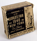
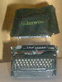
Illustration #18A
Miniature version of
Duchamp’s Underwood cover
from 1941 Boite-en-Valise
along side a New York
World’s Fair miniature
bank with its box pictured
above
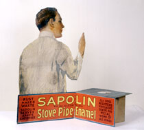
Illustration #18B
Large size version of
Sapolin sign showing a
man painting 32 1/8
x 32 7/8”
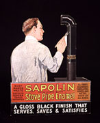
Illustration #18C
Small size version of
Sapolin sign showing
same man painting 6 1/2x 8”
6. Duchamp’s 50cc.of Paris Air (1919) medical glass ampule
Here we encounter another excellent case of the historical record not supporting Duchamp’s claim that his readymade object is a mass-produced, easily store-bought object. Duchamp’s alleged medical glass ampule (1919) is oddly titled 50cc. of Paris Air. But the similarly sized glass of 1964 (one of the Schwarz editions of 14 in our collection) measures approximately 125cc. Duchamp claimed that he opened a standard glass medical ampule purchased at a pharmacy (at a non-existent address of parallel streets that he described as a corner). After emptying it, Duchamp said that he asked the pharmacist to reseal it, thus trapping the air of Paris inside (see illustration 19).
click to enlarge
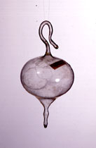
Illustration #19
Marcel Duchamp, 50cc
of Paris Air, 1919
No duplicate ampule was
ever found “mass-produced”
and “readymade” despite
Duchamp’s claim
We have collected numerous examples of medical glass ampules (circa early 20th century) from the US and across Europe (see illustration 20A, B and C). Our collection permits comparison of the typical shapes of mass-produced ampules, with their cylinder forms for easy and safe packing into rows, with Duchamp’s impractical miniature ampule from his 1941 Boîte-en-Valise. (We measured the volume of our miniature 1941 version of 50cc. of Paris Air shown here in illustration 20D and found the capacity to be approximately 35cc. despite the title). (14)
click to enlarge
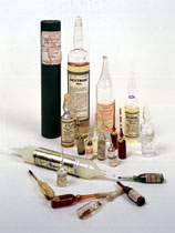
Illustration #20A
Our ampule collection
illustrates that Duchamp’s
50cc of Paris Air,
1919 and his miniature
are historical anomalies.
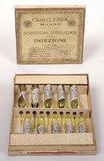
Illustration #20B
Box of ampoules from
Milan, early 20th century
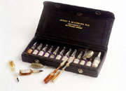
Illustration #20C
Box of ampoules,
early 20th century
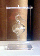
Illustration #20D
Marcel Duchamp, miniature
version of 50cc of Paris
Air for the Boite-en-Valise,
1941, is unlike any mass
produced ampule in our collection
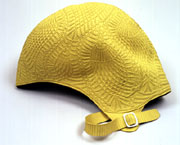
Illustration #22
Jantzen rubber bathing
cap, 1920’s style
7. Duchamp’s
bathing cap work, Sculpture for Traveling (1918)
Once again we have another case where no published photograph illustrates this original 1918 in its detailed and completed form. Only a 1941 retouched, hand colorized print, included in his Boîte-en-Valise and two studio photographs, exist to buttress Duchamp’s story that he took various colors of rubber bathing caps, cut them up and tied them together with string, as reproduced in illustration #21A, B,and C.
We have acquired a rare yellow Jantzen rubber bathing cap (circa 1920’s style) with its textured surface and molded shape typical of a product that has now disappeared from the market place but was then (1918) in fashion. One needs the bathing cap as reference to correctly imagine and reconstruct this important 1918 proto-installation work, see
click to enlarge
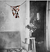
Illustration #21A
Marcel Duchamp, retouched
reproduction of Sculpture
for Traveling,
Boite-en-Valise, 1941
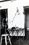
Illustration #21B
Marcel Duchamp, Sculpture
for Traveling is included in a studio
photograph, 1918
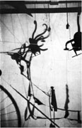
Illustration #21C
Marcel Duchamp, Ombres
Portées (Cast Shadows),
1918, also shows
sections of Sculpture
for Traveling
Conclusion
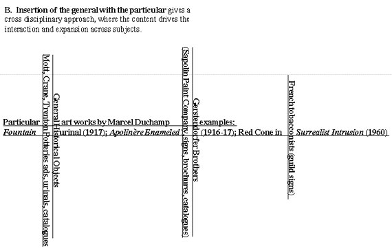
The aforementioned examples represent only a few cases among the many that I could have discussed. I have argued that, in Duchamp’s work, the historical context is vital to scholarly research and understanding, and therefore requires a collection parallel to the actual, objectively valuable art works. Cross-disciplinary studies have long been defended in principle, but rarely in practice, as an idealized vision for scholarship. Collections parallel to collections of art objects, consisting of historical objects relevant to specific works, historical records such as books, catalogues or patents and other ephemera and letters, promise not only preservation of our cultural heritage but also an active matrix for cross-disciplinary research in the arts (see graph A and B). In contrast to the parallel collections in graph A, graph B shows the junctions of the general with the particular. Make intersections between the two collections and your work becomes literally cross-disciplinary, and extendable in many directions. X marks the spot for the future of scholarship, where culture and objects meet for active education and learning, not static storage and display in libraries and art museums.
click images to enlarge

Graph A
Graph B
Notes
 1. Duchamp falsely claimed and the public mistakenly believed that he was only “breathing and playing chess” and that he had not been making art since 1923.
 2. See brochure on exhibition; “Eau & Gaz A Tou Les Étages: La Dation Alexina Duchamp”, 29 May – 5 June, 2000, Centre Pompidou, Musée national d’art moderne, centre de création industrielle.
 3. Duchamp scholar William Camfield discusses his failed search for a duplicate urinal. He was the first to speculate that perhaps none exists (William A. Camfield, Marcel Duchamp: Fountain, The Menil Collection Houston Fine Art Press, 1989). Moreover, Kirk Varnedoe testifies as to how his team of researchers also failed to find exact duplicates of any Duchamp “readymade” in the historical record (see Rhonda Roland Shearer “Marcel Duchamp’s Impossible Bed and Other “Not” Readmade Objects: A Possible Route of Influence From Art to Science,” Part I and II, Art & Academe, Vol. 10, No. 1 & 2, Fall 1997 and Spring 1998). My research reveals that plumbing pottery manufacturers so infrequently altered any of their standard toilet, urinal, bath tub or other products that none had a full time modeler, see book by Arhcibald M. Maddock, II, The Polished Earth: A History of the Pottery Plumbing Fixture Industry in the United States, Trenton, New Jersey, 1962.
 4. The premise and rules of the exhibition stated that any artist would be free to exhibit any work, unjuried, as long as they paid the entry fee. Duchamp’s urinal (signed and submitted by his alias “R. Mutt”) rawly exposed his fellow artists’ pretenses and hypocrisy.
 5. Greg Alvarez’s and my analysis of these urinals indicates that the two photographs of Duchamp’s studio which include urinals are showing Bedfordshire urinal types — dissimilar in form from Duchamp’s 1917 Stieglitz urinal. Therefore, Duchamp’s studio photographs show a different urinal from the one represented in the 1917 Stieglitz photo.
 6. Note that Duchamp altered the letters “manufactured by Gerstendorfer Bros.” to what had been generally believed to be a nonsense statement. Stephen Jay Gould and I, along with André Gervais, are preparing an essay with an alternative interpretation and analysis.
 7. The only two exceptions are formal framed portraits of Presidents of the United States.
 8. Duchamp’s friend and expert on his works, Arturo Schwarz and other scholars support the belief that this note was written by Duchamp. We are pursuing further forensic analysis by hand-writing experts. In addition, Hector Obalk’s opinion as an expert on Duchamp’s writings states that “the writing is not inconsistent with Duchamp’s handwriting.” (interview with the author, July 2000)
 9. See my article, Duchamp’s Impossible Bed, in footnote no. 3 above.
 10. I am grateful to Francis Naumann who reported to me that he had purchased this Hershey postcard himself.
 11. I am grateful to Ecke Bonk who first informed me about the 14 ton giant Underwood typewriter (depicted with women) at the 1939-40 New York World’s Fair.
 12. Underwood typewriters were frequently in the press with advertising and news stories about typing contests and awards, typing speed champions as well as blindfolded typing competitions. We have examples of these ads in our collection.
 13. See article in Scientific America (Vol. CXII. No. 9, Feburary 27, 1915, p. 202), also in our collection.
 14. Unlike the 1919 version of 50cc. of Paris Air, Duchamp tells us where he had the 1941 version custom made in Paris.


