Wanted: Original Manuscript on Marcel Duchamp
click images to enlarge
- Figure 1
- Figure 2
- Figure 3
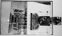
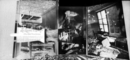
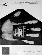
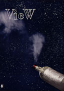
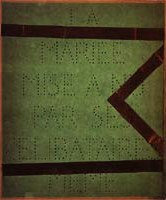
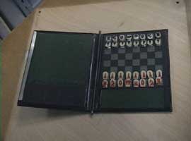
Frederick J. Kiesler and Marcel Duchamp,center fold-out tryptich for View (ed. Charles Henri Ford),vol. 5, no. 1 (March 1945), various details
Sometimes we tell each other Duchamp stories, which might surprise you since, you would reasonably point out, there is practically nothing about old Marcel that hasn’t been told, already, to death. Yet if God is in the details, the endlessly ironic touches in Duchamp´s narrative are also, even in their apparent irrelevance, the source of a strong exhilaration and brilliance.(1)~Rosalind Krauss
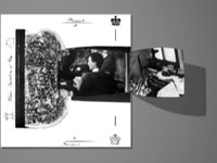
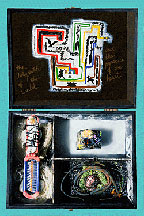
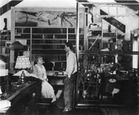
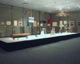
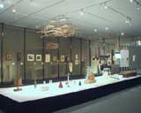
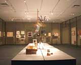
Frederick Kiesler and Marcel Duchamp met in the mid-1920s in Paris and stayed in contact until the early 1950s when, for reasons still unknown, their friendship suddenly seems to have fallen apart. During those 25 years, Kiesler and Duchamp worked within the same vein, both occupied with predominant themes like perception and mechanisms of visions. They shared the same friends in Paris and frequented the same intellectual circle in New York. In 1937 Kiesler published his first article on Duchamp´s Large Glass(2) based on the extensive use of photomontage and on a free association of images. Five years later, Duchamp rented a room in Kiesler´s apartment for twelve months. Also in 1942, Kiesler designed the gallery Art of This Century for Peggy Guggenheim in which he installed a Vision Machine(3) to look at a series of reproductions from Duchamp´s Bôite en Valise.(4) During the 1940s Kiesler and Duchamp collaborated on several projects such as the cover of the 1943 VVV Almanac and the exhibition Imagery of Chess at the Julien Levy Gallery in New York. In 1947 they worked together again in Paris at the Exposition Internationale du Surréalisme for which Kiesler designed the Salle des Superstitions. A few months later, Kiesler executed a portrait in eight parts of Marcel Duchamp which can probably be considered the last collaboration between the two artists.(5) The Archive of the Frederick Kiesler Center in Vienna preserves a photocopy of some handwritten notes(6) by
click to enlarge
Figure 4
Frederick J. Kiesler,
picture of Marcel Duchamp
used for View-tryptich,
1945 (Archive of the Kiesler
Center, Vienna, Austria)
Frederick Kiesler recording various events of Marcel Duchamp´s life. This copy came to our attention half a year ago. As far as we know, an excerpt from this manuscript has been quoted only by Jacques Caumont and Jennifer Gough-Cooper in their remarkable text on Marcel Duchamp and Frederick Kiesler(7) , in which they have reported a passage regarding Raymond Roussel and chess. In their text they did not specify the provenance of the source(8) but they date it to 1945, when Kiesler provided a triptych-photomontage published in View.(Figs. 1-3, 5, 6) The issue included several other texts on Marcel Duchamp, while Kiesler’s photomontage combine photos of Duchamp´s studio at 210 West 14thStreet with reproductions of his works(9) . Furthermore, the Archive of the Kiesler Center preserves some of the pictures which used to compose the triptych. (Fig. 4) Those images – in combination with the manuscript – help to complete the puzzle of the complex relationship between the two artists and they reflect Kiesler´s ability in transforming real images in surreal visions where the borderline between reality and fiction fades.
Three books inspired the decision of presenting this text in a typographical version: the Green Box by George Heard Hamilton and Richard Hamilton;Á l´Infinitif by Ecke Bonk, and last but not least Affectionately, Marcel by Francis M. Naumann and Hector Obalk. We have tried to follow this tradition in a sort of divertissement which helped us to approach the world of the »Emeritus for Chronic Diseases of the Arts«, as Kiesler once described Marcel Duchamp(10).
click images to enlarge
-
-
-
Click to see video animation (455KB)
download QuickTime Player
- Figure 5
- Figure 6
- Animation
-
Marcel
Duchamp, front cover for
View, vol. 5,
no. 1 (March 1945) -
Marcel Duchamp, back
cover for View,
vol. 5, no. 1 (March 1945) -
Frederick J. Kiesler and
Marcel Duchamp, center fold-out
tryptich for View
(ed. Charles Henri Ford),
vol. 5, no. 1 (March
1945), animated detail
Anyone who has information on the original manuscript, please contact the Kiesler Center at: research@kiesler.org
[The typeface used for Kiesler´s handwriting is Baskerville Old Face; for Lillian Kiesler´s it is Zapf Calligraphic and for the footnotes it is Times New Roman.]
Click to browse through
Notes
 1. R. Krauss, The Optical Unconscious, London/Cambridge 1996, p.95.
2. F. Kiesler, Design Correlation in: »Architectural Record« May 1937, pp.53-60.
3. For more information about Vision Machines see Y. Safran, »L´angle de l´œil« in: Frederick Kiesler. Artiste Architecte, Paris 1996 and D. Bogner »Frederick Kiesler et la Vision Machine« in: Vision Machines, Nantes 2000.
4. For more information on the gallery Art of This Century see E. Kraus; V. Sonzogni a.o., Friedrich Kiesler: Art of This Century, Ostfildern 2002.
5. In the 1950s no more trace of communication between them can be followed, not even through Kiesler´s wife Steffi, also a good friend of Duchamp. A reason for the end of their friendship could have been the so-called »Affaire Matta« which involved several surrealist artists following Gorky´s death in 1948.
6. The manuscript is composed of five pages numbered later by Lillian Kiesler. Lillian gave it a title pertaining to the possibility that those papers could contain some notes written by Kiesler during an interview with Duchamp.
7. J. Gough-Cooper and J. Caumont, »Kiesler und Die Braut von ihren Junggesellen nackt entlößt, sogar« in: D. Bogner a.o., Friedrich Kiesler 1890-1965, Wien 1988, pp.287-296.
8. »Kiesler schrieb mehrere undatierte Seiten über das Große Glass, auf die er auch einige interessante biographische Notizen kritzelte, Informationen über Duchamp, die er zweifellos schon in der Zeit vor der Veröffentlichung inView gesammelt hatte.« (»Kiesler wrote several undated pages on the subject of the Large Glass onto which he also scribbled some interesting biographical information on Duchamp, no doubt collected prior to the publication in View«) J .Gough-Cooper and J. Caumont, ibid. p.293.
9. Kiesler used a photomontage technique in combination with double exposure of the film in order to achieve, in a sort of ghostly effect, a vision of the Large Glass superimposed to a wall of Duchamp´s studio.
10. See the notes to the triptych in View (ed. Charles Henri Ford), vol. 5, no. 1, March 1945 (Marcel Duchamp number).
Figs. 1, 3, 5-6
©2003 Succession Marcel Duchamp, ARS, N.Y./ADAGP, Paris. All rights reserved.
Marcel Duchamp and the Museum of Forgery
When I was in high school, I fell for awhile under the spell of the curious life and work of the Dutch forger Hans van Meegeren. I was particularly struck by how the forger’s art is simultaneously self-aggrandizing and self-effacing, selfish and generous, bold and timid. This early entrancement opened into a broader fascination with dubious artworks of all kinds, especially those that floated on the borders of acceptability–misattributed works, “school of” works, authorized copies, partial fakes, restored works, and so on.
Eventually it occurred to me that the world needed a museum devoted entirely to the subject of forgery. I was thinking of something on the scale of the Metropolitan Museum of Art, where all of the world’s most interesting forgeries and fakes, as well as contested works, could find a home. There the works that are normally banished to the basement and the scholar’s office would be displayed in public as rightful exhibits in the great ongoing debate over what constitutes art and how we assign value to objects. At the same time, I realized that very likely no one would ever found such a museum, filled as it would be with works that most people consider valueless and shameful.
In the late 1980s, after the museum idea had lain dormant for awhile, I started using computers as part of my art-making process, and the deceptively simple fact that copies of digital files are perfectly identical to their originals started me thinking again about the relationship between reproduction and value. Around the same time, I happened to be reading Gianfranco Baruchello and Henry Martin’s wonderful book Why Duchamp? and mulling over what is involved in asserting that something is or is not a work of art. It came to me that it would be truer to the paradoxical nature of a museum of forgery if such an institution were dedicated to the practice rather than simply the display of forgery, and I decided to found my own Museum of Forgery along such lines. Display of forgery within the museum raises questions about where the boundary between authentic and inauthentic lies but accepts the idea of the boundary, while practice of forgery within the museum erases that boundary by asserting a fundamental identity between the museum and that which the museum rejects.
A great part of what museums still have to offer of unique value is their institutional authority, a point that Marcel Broodthaers took long ago when he created the Museum of the Eagle. This enduring authority is a second reason why I founded a museum instead of, say, doing a series of projects about forgery. Being the director of a museum gave me a way to speak and be heard on so tendentious a subject as forgery. In this, as in many other aspects, the Museum of Forgery is a child of Marcel Duchamp: it nominated itself as a museum despite the fact that by many definitions it does not belong in that category at all.
Click to go to page
Figure 1
Josef Albers: Studies in
Transmitted Light, 1993,
generic posthumous
albers. A series of digital
works created especially for
the Museum of Forgery to
extend Josef Albers’ reflected
-light color studies into the
realm of transmitted light.
Each image is a study in the
color properties of transmitted
light viewable through such devices
as computer monitors.
In other ways, too, the Museum of Forgery is both museum and anti-museum. It has a permanent collection some of which is now digital, which is to say that a substantial portion of its collection consists of items that are neither objects nor singular. The Museum of Forgery’s first all-digital project was Studies in Transmitted Light, a series of color studies extending Josef Albers’s work with color in reflected-light media, such as paint, to the very different realm of transmitted-light media, such as monitors. (Fig. 1) There is not only no reason to output these works in the realm of material media–say, as paper-based prints–there is every reason not to do so.
What physical collection the Museum has is dispersed; indeed, the Museum has never had a single physical location of any kind where it could be visited. Like most institutions, it is largely façade-a name with a mailing address or, more recently, an Internet address. It isn’t even quite right to say that you can visit it on the web-it would be by loading itself into your browser.(1)
Duchamp the Forger
As the Museum of Forgery unfolded bit by bit, it became clear that one of its chief lines of inquiry was going to be what I loosely call nominalism–artworks in which the primary activity is attaching a new name to something. In semiotic terms, this art of renaming always disrupts an understood link between signifier and signified. In the simplest sense, all art is nominalist: when the artist attaches her signature in the corner, the painting of a landscape becomes no longer “a landscape” but “an O’Keeffe.” The signature bears witness to the creator’s existence, and in doing so elides the distinction between artwork and artist. Both are “an O’Keeffe.” (2)
Forgery, on the other hand, twists the function of the signature, forcing it to bear witness to the actual creator’s absence by pointing to some other more famous person, the creator. Forgers accept that what is key is not who actually created the work but what name is attached to the work (to put it in market terms, they understand the importance of name branding). From this perspective, Marcel Duchamp is more easily understood as a forger than an artist, or perhaps as the first person to really bridge these traditionally opposed fields. Forgery has varying definitions, but most fundamentally it is that-which-is-not-art. However much it may resemble art, it is absolutely excluded from being art. The forger’s object is to pass these absolutely excluded objects into the field of art under the flag of the signature. This effort can never wholly succeed because forgeries have only two ontological statuses: valueless-because-known-as-forgery, and valuable-because-not-yet-exposed. The missing third category is valuable-even-though-exposed; and it is with this category that Duchamp made great play.(3)
When Duchamp attached the name art to various ready-made items by means of the secondary name (signature) Duchamp, he was following the method of the forger. These nominations of ordinary objects as art were a kind of up-front forgery in that they attempted to pass off something understood to be worthless (in the context of art) as something valuable. Duchamp’s method of forgery was unique in several respects. In the first place, even as Duchamp accepted the preeminence of his signature as that which gave the work value, he used it to point away from itself. His nominations tend to cast the emphasis back onto that to which his signature is attached: the thing chosen (a urinal!) tends to displace the act of signing (nominated by Duchamp). In the case of most forgery, by contrast, the signature (a Leonardo!) is enormously more important than the work signed (a painting of something-or-other).
In the second place, he worked in the open, thus unlinking the idea of forgery from the necessity of deceit. In this respect he worked in a mode made so familiar to us by corporate capitalism as to be almost invisible: he attached his brand name Duchamp to an otherwise ordinary object that was actually the product of someone else’s labor. In his work with ready-mades, Duchamp essentially created a new market for a few existing products, and part of his genius lay in recognizing and treating the art world as a modern market–not just a place where artworks were marketed (as it already was), but a place where works of any kind could be marketed as art.
In the third place, Duchamp forged himself. The usual forger forges someone else; that is, nominates one of her own works as a Leonardo or a Picasso. The forger thus appropriates someone else’s name to her own object. Duchamp, however, appropriated someone else’s object to his own name; or, to look at it the other way around, expropriated his name to someone else’s object. Thus, all of his ready-mades were forged Duchamps in the same sense that Van Meegeren’s paintings were forged Vermeers. In both cases the signature does not correspond to the creator of the object.
Excessioning
In selecting works to bear his signature, Duchamp also opened a new line of thinking in which affinity with the work selected becomes more important than the mode of its creation. As in the bulk of his other work, he points away from the reigning mythology centered on “the hand of the artist.” In this also he has something in common with forgers, who must of necessity imitate the hand of particular artists but whose very attempt to do so asserts that the chosen hand is not unique (because imitable) and therefore not worth the supreme value assigned to it.
click to enlarge
Click to go to page
Figure 2
Invasion of the Body
Snatchers, Piazza S.
Gaetano, Naples, 1958/1992,
29 x 21 cm, generic baldessari.
A work commissioned by the Museum
of Forgery and contributed to
the oeuvre of John Baldessari.
The idea of looking at the relationship of artist to artwork as one of affinity rather than production was the spur that led me to form the Museum of Forgery’s Excessioning Program. Under this program, new works are attributed to the oeuvres of appropriate artists, living or dead, regardless of who actually created them. The Museum of Forgery has created (or commissioned) works “by” Marcel Duchamp, Josef Albers, and John Baldessari, among others, as part of its Excessioning Program (Fig. 2).
Just as it sounds, excessioning is an inversion of the normal museum activity of accessioning, reflecting a fundamentally outward orientation, a movement away from the museum itself. By contrast, the existing word de-accessioning reflects the inward orientation of traditional museums: de-accessioning can only be a secondary activity, subordinate to the primary activity of collecting (accessioning). The underlying impulse behind excessioning is to recover a sense of both generosity and honesty in the way artworks are categorized and discussed. Works that are part of a particular aesthetic-a duchampian aesthetic or an albersian aesthetic-are explicitly recognized as such, in contrast to the usual art world practice of concealing and minimizing a new work’s resemblance to its predecessors. (4)
The Excessioning Program models itself on the larger social practice by which well-known trademarks, like Kleenex or Band-Aid, eventually pass into common vocabulary as generic nouns–small-k kleenex–despite intensive and prolonged efforts by the parent companies to prevent this. Manufacturers may be forced by law to use ugly circumlocutions like “facial tissue” on their boxes, but the rest of the world just asks for a kleenex. Similarly, Mona Lisathe brand-name Leonardo has given way to “mona lisa,” a generic that includes Duchamp’s many variations on L.H.O.O.Q. (Parenthetically, it is interesting that Duchamp’s guess that any artwork has a meaningful life span of about 30 years is not far off the patentable life of a commercial product.)
click to enlarge
Click to go to page
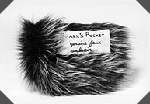
Figure 3
Shark’s Pocket, 1992,
11 x 17 x 2 cm overall, generic
posthumous duchamp. A shark’s pocket
made of genuine faux sealskin and
contributed by the Museum of
Forgery to the oeuvre of Marcel Duchamp.
This work is currently on extended
loan to the Museum of the Double.
Similarly, small-d duchamps are generically all those works of art that belong to the aesthetic pool Duchamp himself started. An early Museum of Forgery project was the Shark’s Pocket, a small object of faux sealskin shaped exactly like an ordinary pants pocket (Fig. 3). It has been sewn closed, and concealed inside is a mystery item, the answer to a question I asked myself one day: if sharks had pockets, what would they carry in them? Once it was created, the affinity with Duchamp’s 1916 workWith Hidden Noise and the general absurdity of the premise led me to declare it a generic duchamp.
In the years since I founded the Excessioning Program, I’ve noticed the idea of generics popping up in other contexts–not, I think, as a result of the Museum’s activities so much as a general effect of zeitgeist. I recently heard an artist refer to something she had just made as a “cornell box” and knew instantly what kind of thing she meant. And anyone who has read William Gibson’s 1987 cyberpunk novel Count Zero will remember the artificial intelligence that spends its time making small-c cornell boxes which others then pass off–for large sums of money–as large-C Cornell boxes.
Generics, as the Museum calls the fruits of its Excessioning Program, reflect the cultural shift towards the privileging of information over objects. A duchampian generic is essentially a transmission vector for some of Duchamp’s ideas, which are more important and enduring than any single one of his works. Indeed, even traditional art museums today are less object repositories and sites of pilgrimage than culture transmitters and sites of shopping. In sponsoring manifold replications, from postcards to coffee mugs to replica jewelry, museums function as memetic factories. The vermiform collection exists not to be visited so much as to be reproduced. Museums have become little more than businesses whose primary product is art spin-offs, with large showrooms where their very handsome product templates are tastefully displayed.
Do-It-Yourself Forgeries
It is in part because our attention is currently focused on reproduction in all its varieties that the Internet and other digital media are displacing the museum and the gallery as loci of art activity. In the computer, originals and copies no longer mark out opposite ends of a fixed spectrum but define something more like a field with points of attraction but without fixed positions. The computer is the realm of the original copy, the simulated original, the multiple singularity, the infinite variation.
Duchamp’s L.H.O.O.Q. works prefigure the fluid metamorphoses of digital art, the return to a practice centered on themes and (valuable) variations rather than originals and (degraded) copies. At one point, he took a group of ordinary postcard reproductions of the Mona Lisa and entitled them L.H.O.O.Q. Rasée (Shaved L.H.O.O.Q.), thus implicitly declaring the Leonardo Mona Lisa a modified version of his own L.H.O.O.Q. Duchamp’s work thus became, by an act of temporal transubstantiation, the original, and Leonardo’s the incomplete copy.
These and other Duchampian projects–such as the authorized Bicycle Wheel replicas–prefigure two other areas of Museum activity, authorized forgeries (Fig. 4) and do-it-yourself forgeries. In order to encourage forgery as a practice the Museum publishes step-by-step directions for re-creating existing artworks. One such DIY project, The Labyrinth of the World and the Paradise of the Heart, can be found on the Museum’s web site (Fig. 5). At the same time, the instructions are loose enough to leave scope for individual variation, as a way of encouraging a new aesthetic of close copies. In Western art since the rise of individualism, it has been impossible for an aesthetic of close copying and subtle variation to arise; close copies are consistently devalued with such terms as “forgery,” “student work,” or just plain “copy.” The DIY forgeries attempt to reclaim the practice of copying by harnessing it to the popular do-it-yourself movement. Although in some respects both nostalgic and a product of mass-marketing–a typically American contradiction–the DIY movement does reflect an underlying belief in experimentation and a championship of making over buying. (5)Paradoxically, creating a do-it-yourself forgery brings the maker much closer to the practice of art than buying a Van Gogh poster in a museum ever could.
click images to enlarge
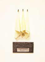
- Figure 4
- Figure 5
- Snotrags,ca. 1992, approx.
10 x 20 in. overall (not including instructions).
An authorized forgery created by
Yolande McKay for the Museum of
Forgery, this work also doubles as
a kind of prototype for a do-it-yourself
forgery since it includes an
instruction sheet for making one’s
own version of the piece.
The instructions read in part: “Only
a sick person can complete
this forgery….blow your nose or in
some other projectile manner
apply mucoid matter to snotrag
provided….apply forged
signature with small brush and paint.” - Slem Joost, The Labyrinth
of the World and the Paradise
of the Heart, 1992/93,
24 x 32 x 10.5 cm, mixed media.
The original of this do-it-yoursel
fforgery was created by Joost,
a Dutch artist, under the
inspiration of a poem by the
French poet Guillaume Apollinaire.
The Museum of Forgery is now just a decade old. It quite often happens that someone will write the Museum asking to be taught how to counterfeit money or fake antique furniture (apparently without any anxiety over the fact that this might be an indiscreet question to put to a complete stranger). And each time I get such an inquiry, I am reminded again of just how tempting it is to believe that what you see is what you get: despite the evidence of its web site, the Museum of Forgery must be simply what it says it is. In this new age of WYSIWYG (6)everything, the real problem remains the same as ever: what you assume is what you get.
Notes
Work Cited:
Baruchello, Gianfranco and Henry Martin,Why Duchamp? (New York: McPherson, 1985).
1. The Museum of Forgery’s web address is http://yin.arts.uci.edu/~mof/index.html.
2. Formerly, this relationship was made explicit by following the painter’s name with the verbs pinxit or fecit–X painted (made) this therefore X was here-but in current practice, the signature alone stands in for the statement. It has long been common to refer to particular pieces in an artist’s oeuvre as signature works, these being the works considered most characteristic of the artist, and thus most credible as mute witnesses to being.
3. There is a fourth category, of course: valueless-although-not-yet-exposed. Although interesting in its own right, it lies somewhat outside the current discussion.
4. A secondary impulse is to extend the terrain that is open to exploration by artists. As matters now stand, in the futile quest for novelty, large areas of the Library of Form are roped off and marked with no-trespassing signs: Property of Brand-Name-Artist X, Keep Out. In some cases the boundaries are enforced by law (especially copyright law), but in many cases the prohibitions are self-enforced by artists who recognize that, as the game is currently played, it is professional suicide to become known as an “imitator” or “follower” of Brand-Name-Artist X.
5. Although the belief in experimentation is duchampian, the elevation of creating over buying is distinctly un-duchampian.
6. [Editor’s note:] Short for “what you see is what you get.”
Rarity from 1944: A Facsimile of Duchamp’s Glass
click to enlarge
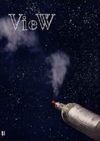
Figure 1
Marcel Duchamp,front
cover for View
Introduction
by Thomas Girst
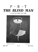
On the last page of Charles Henri Ford’s View (Fig.1) magazine of March 1945 (vol. 5, no. 1), an issue entirely dedicated to Marcel Duchamp, who designed both the front and the back cover, the attentive reader may come across an advertisement (Fig.2) placed left of Duchamp’s famous double portrait (Fig.3) showing the an-artist at both 35 and the then imaginary age of 85.
click images to enlarge
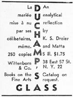
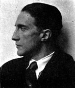
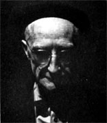
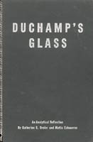
Figure 2
Figure 3
Figure 4
Advertisment in View magazine, vol. 5, no. 1 (March 1945), p. 54 (detail)
Marcel Duchamp at the age of 35 and 85, in View, p. 54 (detail)
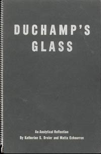
Front cover for Duchamp’s Glass, La Marieé mise à nu par ses célibataires,
même: An Analytical Reflection, 1944
The small ad draws attention to the then recently published book by both the rich art patron and collector Katherine S. Dreier as well as the Chilean-born Surrealist painter Roberto Matta Echaurren: Duchamp’s Glass, La Marieé mise à nu par ses célibataires, même: An Analytical Reflection. (Fig.4) The slim ring-bound volume distributed by Wittenborn and Company, was published in May 1944, in an edition of only 250 copies, by the Société Anonyme, Inc. / Museum of Modern Art, New York.
click to enlarge
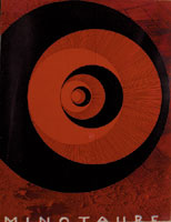
Figure 5
Marcel Duchamp, Front
cover for Minotaure,
ser. 2, no. 6
(December 1934)
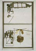
Figure 6
Marcel Duchamp,
The Bride Stripped
Bare by Her Bachelors,
Even,1915-23
Besides André Breton’s essay “Phare de la Mariée” (or “Lighthouse of the Bride”), first published in French in an issue of Minotaure(Fig.5) in December 1934 ( Paris; ser. 2, no. 6, Winter 1935, cover design: Marcel Duchamp), Dreier’s and Matta’s writing is only the second text and the very first monograph to discuss Duchamp’s major work, The Bride Stripped Bare by Her Bachelors, Even (1915-1923) (Fig.6) at length and the very first one to appear in English on the subject matter. Breton’s essay appeared in book form not until 1945, within a revised and enlarged edition of Le Surréalisme et la peinture(New York: Brentano’s), a collection of his theoretical writings on painting. An English version did not appear until that same year, within aforementioned issue of View magazine and most likely translated by Charles Henri Ford himself.
Unlike Breton at the time he first wrote his essay, mostly working from an early exhibition photograph (taken when the Large Glass was first shown at the Brooklyn Museum’s International Exhibition of Modern Art Assembled by the Société Anonyme, New York, November 19, 1926 – January 1, 1927; the only time it was exhibited without the cracks) as well as Duchamp’s notes on his Glass published in the Green Box, (Fig.7) both Matta and Dreier had the opportunity to study the Large Glass in the original. Owned by Katherine Dreier and located at her home in West Redding, Connecticut, it was shipped there after its exhibition in early 1927 when it shattered into hundreds of pieces during the transport. It was repaired by Duchamp only about ten years later when he leaves Paris for New York during trip to the US in 1936. (Fig.8) The repaired Glass remains in Dreier’s living room until 1944 until it is brought to her house in Milford. Connecticut, where it is placed before a window between April 1946 to January 1953. In July 1957, under the supervision of Duchamp, it is permanently installed at the Philadelphia Museum of Art where it remains to this day.
click images to enlarge
- Figure 7
- Figure 8
- Figure 9
-
Marcel Duchamp, Front
cover of the Green Box
[deluxe edition],1934 -
Photograph of Katherine
Dreier and Duchamp at her
home in West Redding, Connecticut,1936 -
Marcel Duchamp,
The Passage from Virgin
to Bride, 1912
Together with Man Ray and Marcel Duchamp, Katherine S. Dreier (1877-1952), herself an artist, had founded the Société Anonyme, the first museum in America devoted to modern art, a subject on which she frequently wrote. Matta (*1911) came to New York in 1939 and after stumbling upon a reproduction of Duchamp’s The Passage from Virgin to Bride (Fig.9) became infatuated with the older artist who soon thought of Matta to be “the most profound painter of his generation.”
The second paragraph of Duchamp’s Glass reads in full: “The essential principles of human consciousness cannot be grasped until we abandon the psychological attitude of conceiving the image as a petrified thing or object; the result of emphasizing the external vision, which is rarely related to perception. The image is not a thing. It is an act which must be completed by the spectator [my italics]. In order to be fully conscious of the phenomenon which the image describes, we ourselves must first of all fulfill the act of dynamic perception.” Here in this pamphlet, the only known collaboration between Dreier and Matta, a crucial concept of Duchamp is introduced for the very first time. Only years later, in April 1957, the artist himself would elaborate further on the importance of the onlooker during his well-known “The Creative Act,” a brief talk given to the American Federation of Arts Convention in Houston. Within it, he states “the two poles of the creation of art: the artist on one hand, and on the other the spectator who later becomes the posterity.” He concludes that “the creative act is not performed by the artist alone. The spectator brings the work in contact with the external world by deciphering and interpreting its inner qualifications and thus adds his contribution to the creative act.”
In this context, it is interesting to note that in 1926, during the Large Glass‘s exhibition in Brooklyn, the Surrealist dealer Julien Levy had apparently noted Duchamp’s later dictum of the fusion of artist and spectator on a mere physical level, remarking upon his initial encounter with this major work: “When I first saw the large glass […] I was fascinated, not merely by the work itself,
click to enlarge
Figure 10
Roberto Matta Echaurren, The
Bachelors Twenty Years
After, 1943
but by the numerous transformations which were lent the composition by its accidental background, by the spectators who passed through the museum behind the glass I was regarding.” (Julian Levy, “Duchampiana,” in: View V, 1 (March 1945), pp. 33-34, p. 34)
Besides three photographs of the Large Glass, a black and white reproduction of Matta’s 1943 paining The Bachelors Twenty Years After (Fig.10) is also included in the 16 page volume, directly incorporating the cracks within. So without further ado, feel free to browse through a scanned version of the scarce original:
Click to browse through
Figs. 1, 3, 5-7, 9
©2002 Succession Marcel Duchamp, ARS, N.Y./ADAGP, Paris.
All rights reserved.
Dreaming with Open Eyes:The Vera, Silvia and Arturo Schwarz Collection of Dada and Surrealist Art at the Israel Museum, Jerusalem
click to enlarge
Click to see video
video1(1.4mb)
Marcel Duchamp, Why
Not Sneeze Rrose Sélavy?
, 1921/1964 © 2000
Succession Marcel
Duchamp, ARS, N.Y./ADAGP, Paris
.
. . . and may I, who am still searching for something in this world,
be left with open eyes, or with closed eyes in broad daylight,
to my silent contemplation.
André Breton, Le surréalisme et la peinture, 1928
The vast collection of works donated by the Milanese scholar, poet, and collector Arturo Schwarz as a gift to the Israel Museum at the beginning of 1998 was an offering of unique scope and importance. Consisting of about 750 works by approximately 200 artists in a variety of styles and techniques, the Vera, Silvia, and Arturo Schwarz Collection of Dada and Surrealist Art constitutes the major part of the total collection amassed by Arturo Schwarz. (The other parts are to be found in the National Gallery of Modern Art in Rome and the Tel Aviv Museum of Art.) This is one of the world’ s greatest collections of Dada and Surrealist art, and since its addition to the Museum’s existing holdings, which include the collector’s extensive library, the Israel Museum has become a global center for the study and display of these two seminal movements in modern art.*
Arturo Schwarz’ s connection with the Israel Museum began in 1972, when he gave the museum a set of thirteen replicas of Marcel Duchamp’s readymades. During the Gulf War of 1991, he decided to donate most of his collection and his entire library to the Israel Museum, and already in 1992 we received the vast library containing more than a thousand items, including limited-edition books, many with original prints, and full runs of Dada and Surrealist periodicals, as well as documents, manifestos, and Schwarz’ s extensive personal correspondence with the movements’ leading figures.
Arturo Schwarz was born in 1924 in Alexandria, Egypt, to Jewish parents: a German father and an Italian mother. In his youth, he was very active in clandestine political circles. At first he was affiliated with the Zionist movement and spent several months on a kibbutz in Palestine; later he became involved in a Trotskyist group in Alexandria. At the same time Schwarz made the acquaintance of the Egyptian Surrealists and from 1945 to 1948 ran a publishing company and a bookstore. Arrested several times for his political activities, he was expelled from the country in 1949. He settled in Milan, where he founded another publishing house and, at the beginning of the 1950s, opened a bookstore which later developed into Galleria Schwarz, which closed in 1975. The gallery held exhibitions of the best Dada and Surrealist artists and of contemporary artists throughout the world. Simultaneously, Schwarz wrote poetry, published scholarly books such as a catalogue raisonné of the works of Marcel Duchamp, gave lectures and organized international Dada and Surrealist exhibitions. His intense involvement in the Surrealist movement and his personal acquaintance with many of its members made him a leading authority on its history.
Arturo Schwarz wrote that “Dada was the first movement in the history of art to liberate the creative process from the shackles of rules and academisms . . . and in Surrealism I discovered a philosophy of life whose cardinal points – love, freedom and poetry – coincided with my own. I have thus never seen myself as an ‘art collector’ but rather as a convinced Surrealist, keen to acquire the works which were inspired by my own convictions.” Indeed, the imprint of his life and personality is manifest in the collection he assembled for years, and the personal portrait reflected in it reveals a combination of two seemingly opposite forces: a romantic-surrealistic vision of imagination, dreams, and love is countered by the critical eye of a scholar and historian who wishes to investigate, to document, and to explain. On the one hand, there is a passion for collection and a spirit of adventure; on the other, methodical assemblage and scholarly classification. Schwarz’s deep conviction that Surrealism is not only an artistic-stylistic trend but a universal spiritual and ideological manifestation that seeks “to break the habit of looking at things in the same way, to revolutionize our vision” is evident in his desire to capture and document every cultural, geographical, and historical aspect of the phenomenon. Thus, his collection contains oil paintings alongside photographic portraits, and books of poetry next to documents, representing a range from Europe to South America and from the sixteenth century to the present. His selection disregards both conventional aesthetic distinctions and any accepted hierarchy of major and secondary works or important and unimportant artists. The result is an encyclopedic cultural mosaic that is impressive and astonishing, especially if one takes into account that it is the lifework of a single individual. Schwarz has explained his criteria by saying, “It is not physical beauty that interests me; it is spiritual beauty and the idea behind it, and when it is strong enough it becomes physical beauty, but not the other way round.”
click to enlarge
video2(1.4mb)
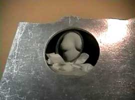
Marcel Duchamp, Female Fig
Leaf, 1950/1951 © 2000 Succession Marcel
Duchamp, ARS, N.Y./ADAGP, Paris
At the end of the year 2000, the Museum will present a major sampling of the Vera, Silvia, and Arturo Schwarz Collection to the public for the first time. Combining Schwarz’s insight and personal approach to collecting with a museological, historical presentation of Dada and Surrealist art, the exhibition Dreaming with Open Eyes will feature 350 representative works in a variety of techniques – paintings, drawings, collages, prints, photographs, sculptures, and readymades – along with dozens of items from the unique library of periodicals, documents, and books. A short introductory film presents the life story of Arturo Schwarz through personal photographs and excerpts from interviews. Using contemporary design language, the exhibition conveys the radical spirit of these two movements. Occupying several galleries, it is arranged by topic as well as in historical order, largely reflecting the main divisions of the original collection.
“Dada Doesn’t Mean Anything”
The Dada movement, which came into being in Europe and the United States in protest at the horrors of the First World War, rebelled against artistic convention and sought to subvert the existing social and political order. The works exhibited, whose main source is the legacy of one of the leaders of Dada, Tristan Tzara, represent the oeuvre of such major artists as Marcel Janco, Jean Arp, Raoul Hausmann, Max Ernst, Francis Picabia, and Kurt Schwitters. Mainly drawings and collages, they exemplify typical elements of Dada: the accidental, the absurd, protest, and criticism. The Dadaists’ desire to fuse life and art and to embrace all areas of creativity is reflected in the accompanying display of their radical periodicals and manifestos, together with excerpts from the early films of Hans Richter.
The Chess Players: Marcel Duchamp and Man Ray
click to see video
video3(1mb)
video4(1.7mb)
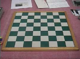
Marcel Duchamp,Chessboard
, ca. 1946 © 2000 Succession
Marcel Duchamp, ARS, N.Y./ADAGP, Paris
Marcel Duchamp,Pocket Chess
Set, 1943/1961~64© 2000 Succession
Marcel Duchamp, ARS, N.Y./ADAGP, Paris
The revolutionary work of Marcel Duchamp and Man Ray had a profound influence on Dada and Surrealist artists and on later trends in twentieth-century art. Arturo Schwarz began to correspond with Marcel Duchamp in the early 1950s and through him made the acquaintance of Man Ray. He demonstrated his deep appreciation of these two artists and his devotion to them by arranging exhibitions, producing series of readymades, acquiring dozens of their works and writing authoritative scholarly books about them. The seventy works by these two artists in the exhibition, which demonstrate their conceptual approach and bear witness to their fertile imaginations, are replete with irreverence, iconoclasm, humor, playfulness, sexuality, and eroticism.
click to enlarge
video5(1.5mb)
Marcel Duchamp, In
the Manner of Delvaux, 1942
© 2000 Succession Marcel Duchamp,
ARS, N.Y./ADAGP, Paris
“Pure Psychic Automatism”: Surrealism
The ideologues of the Surrealist movement, whose conceptual platform was formulated by André Breton in the First Surrealist Manifesto of 1924, wished to develop patterns of thought and expression which would lay bare an inner irrational and subconscious reality like that revealed in dreams, psychoanalysis, and the drawings of children and the insane. Surrealist artists experimented with automatism as a basic principle of random and unmediated creativity, and with illusory dream images in fantastic forms and surprising combinations. In this part of the exhibition, there is a rich collection of more than a hundred works from various periods. Among the artists exhibited are some of the members of the original circle of the Surrealist movement in the 1920s and ’30s, such as André Breton, Joan Miró, Yves Tanguy, André Masson, and Max Ernst, and others who were influenced by it and joined after the Second World War, like Victor Brauner, Wifredo Lam, and Matta. A prominent place is occupied by women artists like Claude Cahun, Remedios Varo, Kay Sage, Dorothea Tanning, and Meret Oppenheim. The works on show illustrate the variety of methods used by the artists to liberate their imaginations from the domination of the critical consciousness, ranging from automatic drawing, collage, and photomontage to collective drawings, dream pictures, and assemblage.
“The Sleep of Reason”: Forerunners of Surrealism
From the very beginning of the Surrealist movement, writers and artists turned to the works of the past for inspiration and affirmation. In art and literature, they did, in fact, find evidence of a timeless interest in dreams, the supernatural, the magical, and the irrational. In the art of the Middle Ages, the Renaissance, and the Baroque, these elements were to be found in such subjects as the Apocalypse, monsters, alchemical symbols, scenes of temptation, and erotica, and in grotesque and hybrid images. From the beginning of Romanticism in the eighteenth century to the Symbolist movement in the nineteenth, the taste for fantasy and the irrational grew stronger: the industrial era gave rise to anxiety and to a longing for a mystical, otherworldly experience. Like Breton and others, Arturo Schwarz assembled examples of pre-Surrealist works characterized, as he said, by “their spiritual attitude toward the marvelous – as well as their subversive element.” This variegated collection includes paintings, prints, and drawings dating from the sixteenth to the twentieth century by artists such as Dürer, Goya, Moreau, and Redon, along with tribal masks and artifacts from Africa, Oceania, and North America.
click to enlarge
Click to see video
video6(1.1mb)
Marcel Duchamp, Cheminée
anaglyphe (Anaglyphic Chimney)
and related
material, 1968 © 2000
Succession Marcel Duchamp,
ARS, N.Y./ADAGP,Paris
Talking Heads:
The Library Portraits of Surrealist artists and writers immortalized by their photographer and painter colleagues constitute a separate section, which Arturo Schwarz calls “memorabilia.” These works have a special value, apart from their documentary and historical importance, in that they shed light on the personal relationship between the artist who depicts and the person depicted. The collection of portraits is combined with a selection of Dada and Surrealist books illustrated with original prints. There are also artists’ books in special editions by Max Ernst, Man Ray, Masson, Picabia, and others, and books produced jointly by pairs of artists like Tristan Tzara and Jean Arp, Benjamin Péret and Yves Tanguy, Robert Desnos and Pablo Picasso, and Paul Eluard and Man Ray. The collaboration between artists manifested in these portraits and books illustrates the intellectual ferment of Surrealism and the spiritual bond that existed among the members of the movement.
The exhibition will be accompanied by a comprehensive 250-page catalogue, which includes an illustrated inventory of all the works in the Vera, Silvia, and Arturo Schwarz Collection in the Israel Museum. An exploration of a perennially fascinating subject, Dreaming with Open Eyes promises to be one of the Museum’s most important and enlightening exhibitions as we begin the new millennium.
* For more on the collector and his gifts to the Israel Museum, see The Israel Museum Journal XVI (1998): 61-70.
Installation
views of the exhibition’s Marcel Duchamp and Man Ray section
click images to enlarge
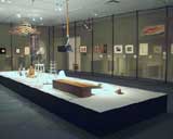
The Vera, Silvia and Arturo Schwarz Collection of Dada and Surrealist
Art, Israel Museum, Israel, 2000
Rarities from 1917: Facsimiles of The Blind Man No.1, The Blind Man No.2 and Rongwrong
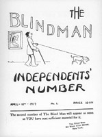
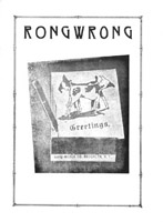
A few years after his arrival in the United States, Marcel Duchamp, together with his friends Henri-Pierre Roché and Beatrice Wood, published three small and very short-lived issues of what can only be described as genuine Dada-journals: The Blind Man No.1 (April 1917; Arturo Schwarz, The Complete Works of Marcel Duchamp, vol. 2, New York: Delano Greenidge, 1997, # 346), The Blind Man No. 2 (May 1917; # 347) and Rongwrong (July 1917; #348). Of the three, the Blind Man No. 2 is best remembered for publishing documents surrounding the scandal of Duchamp’s 1917 urinal Fountain. But the other numbers also hold an abundance of material on the budding, European-infiltrated and subversive New York art scene.
Without further ado, dear reader, please see for yourself!
Only once before, in 1970, were print-facsimiles of the three magazines made. Published in a small edition by Arturo Schwarz (Documenti Dada e Surrealisti, Archivi d’Arte del XX Secolo, Rome; editor: Gabriele Mazzotta, Milan) in a brown cardboard folder whose design imitates wood, Dada Americano also includes reprints of Duchamp’s and Man Ray’s one and only issue of New York Dada (April, 1921) as well as the latter’s four-page foldout of theRidgefield Gazook (No. 0, March 31st, 1915).
The following clickable flip-through visuals of all pages of both issues of the Blind Man as well as Rongwrong are scans from the 1970 Schwarz edition and make their full content available to a large audience for the first time. The original magazines are part of the Vera, Silvia and Arturo Schwarz collection Dada and Surrealist Art at the Israel Museum of Art, Jerusalem.
In recent years, the International Dada Archive of the University of Iowa has started to scan and mount documents from their collection: A number of early Dada magazines may be viewed at http://sdrc.lib.uiowa.edu/dada/collection.htm
(suggested reading: Beatrice Wood, I Shock Myself, San Francisco: Chronicle Books, 1985, esp. pp. 26-36; Francis M. Naumann, New York Dada 1915-1923, New York: Abrams, 1994, esp. pp. 46-47, 184-187; Francis M. Naumann, Marcel Duchamp: The Art of Making Art in the Age of Mechanical Reproduction, New York: Abrams (distrib.), 1999, pp. 74-75)
click images to enlarge
-
Marcel Duchamp, Cover for
The Blind Man No.1
(April 1917) © 2000 Succession Marcel
Duchamp, ARS, N.Y./ADAGP, Paris -
Marcel Duchamp, Cover for
The Blind Man No.
2 (May 1917) © 2000 Succession
Marcel Duchamp, ARS, N.Y./ADAGP,
Paris -
Marcel Duchamp, Cover for
Rongwrong (July
1917) © 2000 Succession Marcel
Duchamp, ARS, N.Y./ADAGP, Paris
Marcel Duchamp: A Readymade Case for Collecting Objects of Our Cultural Heritage along with Works of Art
click images to enlarge
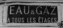
Illustration #1
Eau et Gaz Advertisement, Paris,mid- to late 19th and early 20th century
I was surprised to receive a recent loan request from the Centre Pompidou Museum in Paris for an Eau et Gaz sign from our Art Science Research Laboratory collection here in New York. Eau et Gaz advertisements (see illustration #1) are vestiges from the 19th century Paris, when signs stating “water and gas on every floor” were affixed to the front of buildings to distinguish those premises featuring the modern services that we now take for granted in large cities.
The Pompidou curators realized that their slated exhibition of Marcel Duchamp’s important manuscript notes (mostly written between 1910-’50’s) would be greatly enhanced by including the cultural context that Duchamp drew upon for his early ideas and for related works that followed, even including those which came to light after his death. Duchamp used the “water and gas” theme from the beginning, in his earliest original notes (1911-15) and first selection of these notes for publication (This Quarter, journal 1932) to the cover of his first Catalogue Raisonné (1958) (where he used a faux “readymade” water and gas sign for the boxes of his two deluxe versions), and most significantly, to the largest and last secret work Given 1. the waterfall 2. the illuminating gas, [1944-66], only revealed after he died in 1968. (1)
click to enlarge
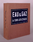
Illustration #2
Marcel Duchamp, deluxe
edition of Robert Lebel’s
Sur Marcel Duchamp, 1958
© 2000 Succession Marcel
Duchamp ARS, N.Y./ADAGP, Paris
Without knowledge about French water and gas signs, now infrequently found on buildings (for all Parisian apartments must be so equipped by law, and landlords need not brag about these services), Duchamp’s major readymade work Eau et Gaz (1958) loses much of its meaning. (See illustration #2 showing Duchamp’s version of a metal sign.)
Alas, despite the fact that our Art Science Research Lab has a nearly complete collection (including documentation of their histories) of the historical objects that Duchamp altered or referred to in his works and writings, we are still looking for an Eau et Gaz sign to replace one that we acquired but that was unfortunately destroyed in shipping. We were therefore unable to fulfill the Pompidou Center’s request.
click to enlarge
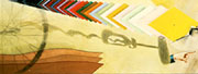
Illustration #3D
Marcel Duchamp, Close-up
view of the corkscrew shadow
in Tu m’, 1918
(Note the shadow’s distorted
form in comparison to the actual mass
produced corkscrew found in
the historical record)
© 2000 Succession Marcel
Duchamp ARS, N.Y./ADAGP, Paris.
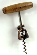
Illustration #3E
Mass produced corkscrew
type that Duchamp likely
used to create his
distorted shadow
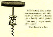
Illustration #3F
Model of a corkscrew from
The Bronson and Townsend Co. catalogue,
1918, shows only one catalogue
source among many to buy the popular
corkscrew design that Duchamp
likely used to create the distorted
shadow in Tu m’, 1918
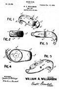
Illustration #3G
Corkscrew patent, Dec, 13,
1898 from the United States
Patent Office for the corkscrew
design Duchamp likely used
as a source for his shadow
alterations.
It is sad for our cultural heritage that art museums have not yet accepted the importance and responsibility of creating special collections as integral and parallel activities to curatorial practice and collecting. In other words, by studying humble and ephemeral historical objects (such as the Paris Eau & Gaz signs).
click to enlarge
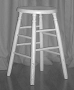
Illustration #3A
Mass-produced old wood stool;
duplicate has been found in
a 1897 Sears Roebuck
catalogue. No stool has
yet been found that matches
the formDuchamp depicts in
his studio photographs and
claimed as mass-produced
and “readymade”.
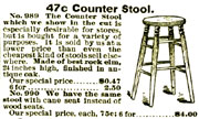
Illustration #3B
Model of a wood stool
from Sears Roebuck catalogue,
1897, illustrates that duplicate
objects can be easily found
in the historical record
Illustration #3C
Marcel Duchamp, studio
photograph, 1917-18,
illustrating a wood stool
not found as mass-produced and
readymade in the historical record.
© 2000 Succession Marcel
Duchamp ARS, N.Y./ADAGP, Paris.
scholars can gain important insights about the cultures and economies that surround the lives of artists and set the contexts of their important works. Is it not ironic that the great Pompidou Museum, with its vast resources and holdings, had to reach out to our small project in America to borrow a distinctively French historic object and, even worse, that we could not provide it for this significant exhibition of Marcel Duchamp, who is now considered the greatest influence upon the last fifty years of 20th century art? (2)
We have initially focused our mission upon the joint collecting of historical objects and reference materials related to Duchamp’s works in combination with our acquisition of the works themselves. This strategy is especially rewarding in this case, given the importance of Duchamp himself and his active utilization of objects and materials from everyday life — objects that are rapidly disappearing not only from our understanding, but also as material and collectible entities.
Our experience has consistently shown us that mass-produced objects from the early 20th century can still be found both as objects and in catalogues. For example, see our wood stool and its 1897 Sears Roebuck source; and a corkscrew, its patent, and a 19th C. catalogue source (in illustrations 3A, B, C, D, E, F and G), Duchamp used and altered both this particular corkscrew’s shadow and a wooden stool, for which we have been collecting general period examples. (The wood stool in 3A duplicates the form shown in the Sears Roebuck catalogue stool in 3B. However, the stool Duchamp used in 3C is still unknown. The corkscrew in 3E, 3F and 3G are the most likely source for Duchamp’s distorted shadow form shown in 3D.) It is indeed strange, and suggestive of Duchamp’s actual artistic practices, that his so-called “readymade” objects, including the 1917 urinal and other alleged mass produced, store bought items, cannot be found in duplicate forms as objects or in commercial catalogues of the period. As time goes on, say in 50 years, the opportunity for readily exploring the historical record and producing such a collection of the objects that then existed (or, in the case of Duchamp, did not exist) may become impossible.
To continue my case for collecting historical objects along with actual art objects, I will discuss seven additional cases illustrating the importance of historical objects to understanding Duchamp’s art works — his famous Fountain urinal (1917); his rectified readymade Sapolin tin paint sign Apolinère Enameled (1916-17); his Hershey postcard note (circa 1915) reproduced in the À’l’infinitif (the White Box [1967]); the red cone on the cover of his Surrealist Intrusion catalogue (1960); his rubber bathing cap sculpture (1918); his glass medical ampule (1919), and finally his Underwood typewriter cover (1916).
1. Duchamp’s Fountain Urinal (1917)
click to enlarge
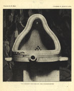
Illustration #4A
Alfred Stieglitz, Photograph
of Fountain The Blind Man
No. 2, 1917 © 2000 Succession
Marcel Duchamp ARS, N.Y./ADAGP, Paris.
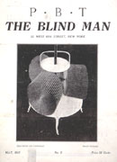
Illustration #4B
Marcel Duchamp, Cover
for The Blind Man No. 2, 1917
© 2000 Succession Marcel
Duchamp ARS, N.Y./ADAGP, Paris.
click to enlarge
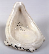
Illustration #5A
Marcel Duchamp, Miniature
of Fountain for the
Boite-en-Valise, 1941
© 2000 Succession Marcel
Duchamp ARS, N.Y./ADAGP, Paris.
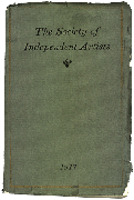
Illustration #5B
Cover for the exhibition
catalogue of The Society
of Independent Artists, 1917
© 2000 Succession Marcel
Duchamp ARS, N.Y./ADAGP, Paris.
Illustration #5C
Marcel Duchamp, Four
Readymades, 1964
© 2000 Succession Marcel
Duchamp ARS, N.Y./ADAGP, Paris.
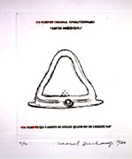
Illustration #5D
Marcel Duchamp, An Original
Revolutionary Faucet: Mirrorical Return,
1964© 2000 Succession Marcel
Duchamp ARS, N.Y./ADAGP, Paris.
Because Duchamp claims that he “lost” this work, the original urinal “readymade” sculpture of 1917 only exists in the form of a photograph taken by Stieglitz right after its famous rejection and ejection before the opening of the 1917 New York Independent Artists Exhibition,(3) (see exhibition catalogue and photograph depicted in Blindman, Issue #2 in illustration 4A,B and 5B). Any 3-dimensional urinals displayed in museums, and said to be by Duchamp and signed R.Mutt 1917, are only later versions beginning with a 1941 miniature for his Boîte-en-Valise portable museum display and includes a 1950 Sidney Janis version (now in the Philadelphia Museum of Art) and a late 1964 series done with Arturo Schwarz in an edition of at least 14 copies. To further add to the confusion, Duchamp states that he purchased his original 1917 urinal at a Mott plumbing store (at a correct New York City address). Yet the shape of his urinal does not match any models found in Mott catalogues or, in fact, in any other plumbing catalogues in 1917, or at any time before or since according to scholars’ investigations of the historical record.(4)
The Art Science Research Laboratory (ASRL) collections includes the Blindman Issue #2 with its Stieglitz photograph of Duchamp’s 1917 Fountain urinal, two copies from among approximately 20 to 25 examples of his signed miniature porcelain urinal that he made for his Boîte-en-Valise (1941); the catalogue from the Society of Independent Artists 1917 exhibition, which rejected R. Mutt’s (a.k.a. Duchamp) Fountain submission, and also, a complete group of the various etchings and studio images where Duchamp includes the urinal (see illustrations 5A, B, C and D). Our rare Mott plumbing catalogues from the time of Duchamp’s Fountain provide an important cultural context for Duchamp’s work, thus permitting scholars to make their own comparisons of the differences between the forms of Mott urinals versus the urinal that Duchamp, within his varied representations, claimed as a “readymade” from the Mott plumbing store.
click to enlarge
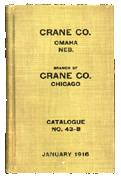
Illustration #6A
Cover for Crane Catalogue, 1916
© 2000 Succession Marcel
Duchamp ARS, N.Y./ADAGP, Paris.
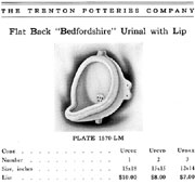
Illustration #6B
Model of a urinal from
The Trenton Potteries
Company catalogue, 1913,
p. 355
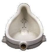
Illustration #6C
1916 Crane Bedfordshire
urinal, stamped Trenton
Potteries on back
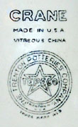
Illustration #6D
Close-up view of the stamp
The historical record reveals that Mott did not manufacture urinals but only sold them under their own label in 1917, as did Crane and other plumbing companies. Trenton Potteries, located in Trenton, New Jersey (the porcelain plumbing manufacturing center of the U.S. at the beginning of the 20th century), made urinals for both Mott and Crane. Trenton Potteries catalogues, also in our collection, show that Mott, Crane and other distributors (within their exclusive manufacturing arrangement) had a limited choice of standardized urinals — and none are shaped like the one depicted in the Stieglitz 1917 photograph in Blindman #2. (note illustration 6A from our collection’s 1916 Crane catalog). The Bedfordshire model (illustration 6B) that Varnedoe and Camfield discuss is the most similar, but is not identical, to Duchamp’s 1917 urinal. This model is also consistently depicted in the Trenton Potteries, Mott and Crane catalogues. Our collection has also acquired three identical Crane Bedfordshire urinals (stamped Crane, Trenton Potteries, see illustration 6C and D) for scholars to examine. (5)
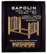
2. Duchamp’stin Sapolin paint sign Apolinère Enameled (1916-17)
click to enlarge
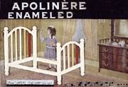
Illustration #7A
Marcel Duchamp, Apolinère
Enameled, 1916-17
© 2000 Succession Marcel
Duchamp ARS, N.Y./ADAGP, Paris.
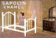
Illustration #7B
Computer simulation showing
how Sapolin sign appeared before Duchamp
added black paint and made changes to letters
Allegedly, Duchamp only slightly altered a 1916-17 Sapolin paint sign to honor his friend, the poet Apollinaire. (Duchamp said that he merely blacked out the “S” of Sapolin, and added ère to the end, and then added ed to “Enamel,” resulting in “Apolinère Enameled.” — implying that he did nothing more. Similarly Duchamp, via additions and eliminations, changed the original inscription at bottom right: “manufactured by Gerstendorfer Bros.” to “Any Act Red by Her Ten or Epergne”). However, Stephen Jay Gould and I went to the Philadelphia Museum of Art’s conservation department to request further analysis to determine the extent and quality of Duchamp’s manipulation of this sign. Examination by conservators (with ultra violet light, for example) revealed that the black paint at the top and bottom of the sign (containing the letter changes, see illustration 7A) was added by Duchamp and that the letters actually “floated” upon the room (see illustration 7B which approximates what would be seen under Duchamp’s alterations (6). According to conservators, no other letter or text is evident. Duchamp’s sign, when judged within context of our extensive Sapolin sign and ephemera collection (with hundreds of items, from the 1890’s to the 1940’s), is quite anomalous because Sapolin signs, in almost every case, include product numbers and sales pitches. (7)
click to enlarge
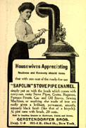
Illustration #8E
Sapolin stove pipe
enamel advertisement
in their campaign
aimed at women
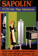
Illustration #8F
Sapolin N. 124 hot
pipe aluminum advertisement
in Art Deco Style
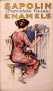
Illustration #8G
Cover page for the
Sapolin Enamels brochure
click to enlarge
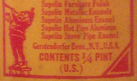
Illustration #8A
Note paint can indicates
Gerstendorfer Bros.
makes Sapolin paint
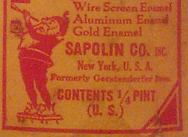
Illustration #8B
Note paint can indicates
“Formerly Gerstendorfer
Bros” and uses the
Sapolin trademark as the
company name to
avoid German prejudice
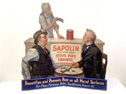
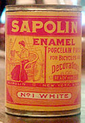
Illustration #8C
Large cardboard sign
depicts two men playing
dominoes and uses Victorian
nostalgia theme from
the early 20th century
Illustration #8D
Sapolin paint in lady sized 1/4 pint can
Just as the Mott urinal research led us to one of the early cases of anti-trust and unfair trade practices (as the plumbing potteries industry “society” in Trenton, New Jersey fixed prices and frequently restricted trade by officially selling only to licensed plumbers and not to the public), Sapolin paint research directed our attention to a firm that began as a late 19th century immigrant German gilding company, Gerstendorfer Brothers, which, by 1902, had quickly expanded to include the speciality of the trademarked Sapolin metal paint. Their adaptation to changing American sentiments toward Germans can be seen in their signs, point of purchase displays, brochures and promotional giveaway items. As of WW1, they were using their trademark name Sapolin as their company name instead of Gerstendorfer Brothers to mitigate anti-German prejudice caused by the war. The collection of Sapolin signs also illustrates trends in advertising, such as a Victorian nostalgia revival and the new look of Art Deco. At that time, the company itself took a bold, new and controversial initiative, creating products and a focused ad campaign aimed toward women (not men!) for painting in the home. Illustrations 8A, B, C, D, E, F, and G show name changes from Gerstendorfer to Sapolin, adoption of changing stylistic trends over time and images of dainty woman-sized Sapolin paint cans, signs and ads in their [controversial] campaign to sell paint to women. All these objects are in the ASRL collection.
click to enlarge
Illustration #9A
First example of
back label naming
Gerstendorfer Bros.
Illustration #9C
Second example of
back label naming Sapolin Co.
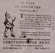
Illustration #9E
Marcel Duchamp’s version
of back label for
Apolinère Enameled Schwarz’s
edition, #5/8, 1965
Note this label only
matches Duchamp’s other version
and not the original labels
© 2000 Succession Marcel
Duchamp ARS, N.Y./ADAGP, Paris.
click to enlarge
Illustration #9B
Third example of original
back label naming
Gerstendorfer Bros using
the same address as
Duchamp’s version below
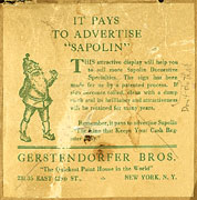
Illustration #9D
Marcel Duchamp’s version
of the Gerstendorfer
Bros, back label on
Apolinère Enameled,
1916-17. Note the distorted
text in the second
paragraph when compared
to the actual historical
label shown above.
© 2000 Succession Marcel
Duchamp ARS, N.Y./ADAGP, Paris.
Of particular relevance to Duchamp scholars are the alterations that he made to the label on the back of his 1916-17 Apolinère Enameled sign, also included on the back of his 1965 Schwarz reproduction. We have one of the edition of 14 in our ASRL collection. As with the urinal, Duchamp created a series of different versions of his Apolinère Enameled throughout his life, including a 1941 version in his Boîte-en-Valise. Only in the original and in the 1941 versions does Duchamp use a back label and write “Don’t do that” next to printed instructions “wipe with damp cloth.” (8) Our collection offers scholars the opportunity to compare Duchamp’s label to the labels in the collection, moving through time from Gerstendorfer Brothers at two addresses (one matching the address in Duchamp’s label) to a later label with the change to Sapolin Company at a still different address. The label’s basic text and design remains the same in all the official Sapolin labels (see illustration 9A, B, and C). However, in Duchamp’s label in both his original 1916-17 and his 1965 Schwarz edition versions (see illustration 9D and E), the word “register” on the bottom line is strangely out of register in comparison to the complete stability of the Sapolin labels in our collection, and which span a long range of time. Only by examining our set of these standard labels can a context be established to determine that Duchamp probably tampered in a subtle way with the standard readymade Sapolin label.
click images to enlarge

- Illustration#10A
- Illustration#10b
- Illustration#10c
- Sapolin No. 124 Hot
Pipe Aluminum advertisement
with 3-D Stove on
2-D tin sign - Sapolin Stove Pipe Enamel
advertisement uses 2D
tin sign and a slightly
raised, (in-between 2D
and 3D) tin pipe - Sapolin No. 123 Deep-Gold
Enamel advertisement with
a slightly raised,
(in-between 2D and 3D)
metal bed
click to enlarge
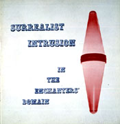
Illustration #11A
Marcel Duchamp, Cover
for Surrealist Intrusion
in the Enchanters’ Domain,
1960, with embossed,
(slightly raised surface)
tobaccoist sign.
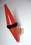
Illustration #11B
Late 19th, early 20th
C French tobaccoist sign
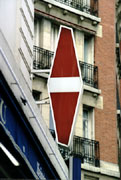
Illustration #11C
Modern two-dimensional
neon tobaccoist sign
3. Red cone on cover of the Surrealist Intrusion catalogue (1960)
Duchamp’s design for the 1960 exhibition of Surrealist Intrusion in the Enchanters Domain (see illustration 11A) includes a red cone object that, even in modern day France, is fast disappearing from Paris streets (and is, in any case, completely unknown here in America).
click to enlarge
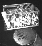
Illustration #12A
A Man Ray photograph
of Marcel Duchamp’s Why
Not Sneeze Rose Sélavy?
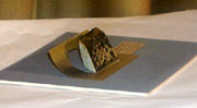
Illustration #12B
Marcel Duchamp’s miniature
reproduction of Why Not
Sneeze Rose Sélavy?
in the Boite-en-Valise,
1941 A 2D photograph is
cut and applied
to a 3D plaster form which
traps this work in-between
2 and 3D Dimensions
Tobacco shops in France today use modern neon 2-dimensional versions of this traditional guild symbol for a tobacco shop (see examples in illustrations 11B and C). An important geometric theme in Duchamp’s notes (1911-15), and within his works, is the transition between 2 and 3 dimensions — illustrated here by the 2-dimensional red cone (embossed into a slight 3-D relief) and its relation to its 3-D form of the original red cone sign. In 1960, Duchamp would already have seen the reduction of this 3-D guild sign to 2-D neon (as shown in illustration 11C) as a social translation of what he was geometrically creating for his 2-dimensional (albeit slightly 3-D due to its embossed texture) Surrealist cover.
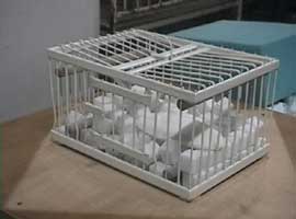
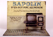
Our red glass tobacconist sign, in connection with a copy of this important Surrealist catalogue and Duchamp’s mathematical notes on the subject (in the White Box Notes, 1967, also included in our collection), and his other uses of similar 2-D to 3-D in-between transitions, show scholars a larger cultural, as well as an interdisciplinary geometric, context when examining Duchamp’s humble Surrealist cover design (see, for further examples, his 2-D photograph [1941] of his 3-D bird cage [1919] mounted on a 3-D plaster mount in his Boîte-en-Valise (1941) that traps between 2 and 3 dimensions [see illustration A and B] and numerous similar examples within Sapolin signs and ephemera such as a 3-D radiator shown in a tin sign as more than 2-D but less than 3 in comparison with Sapolin 3-D radiator giveaway novelty item. [see illustration 13A and B]
click to enlarge
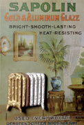
Illustration #13A
Sapolin Gold &
Aluminum Glaze 2-D
tin sign with slightly
raised, 3-D radiator.
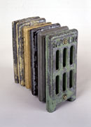
Illustration #13B
Sapolin 3-dimensional
radiator novelty item
click to enlarge
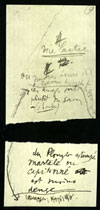
Illustration #14A
Marcel Duchamp, reproduction
of the 1915 original in the
White Box Notes, 1967 (verso)
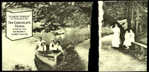
Illustration #14B
Marcel Duchamp, reproduction
of the 1915 original
in the White Box Notes,
1967 (recto). Note upper left 3D Hershey
bar changing into a
2D sign below
4. Duchamp’s
Hershey Postcard note (circa 1915)
Duchamp reproduced his postcard note from the 1910’s in his White Box Notes (1967). Both Duchamp’s original Hershey postcard and his reproductions were torn in half (see illustration 14A and B) and had text written on the back. (10)Duchamp’s interest in 2-D to 3-D dimensional changes is also illustrated by this postcard’s symbol in the upper left hand corner (see illustration 14B and 15A). A 3-D Hershey bar is typically depicted in transition, metamorphosing into a 2-D form on many versions of Hershey postcards.
Illustrations 15A and B show an identical Hershey postcard to the one Duchamp used before tearing, and an original candy wrapper (circa 1910’s). Around the time Duchamp first arrived in New York, in 1915, he was not yet well known for his lifelong love of chocolate and use of the theme throughout his works. We know from the Hershey postcards themselves that he must, soon after arriving in the US, have bought a Hershey bar with an enclosed postcard like the one illustrated in 15A. The Hershey Chocolate Company had a successful campaign for a collectible series of approximately 88 varieties of cards, issued as inserts in Hershey candy bars between 1909 and 1918. The campaign aimed to promote the idyllic town of Hershey, Pennsylvania, the home of Hershey chocolate. Amusingly, as an unintended consequence, numerous requests arrived from male buyers to meet and even to marry the nubile young Hershey girls depicted on the cards. (Allegedly, some marriages actually took place!) Several cards, including the one that Duchamp found and reproduced as his note, were so popular that a series of two additional, regular sized postcards were made. (see illustration 15C.) These two and others are in the ASRL collection. (With one card in green tones, and the two others done over time with small changes in size and color, the Hershey series resembled the series of Duchamp’s themes such as urinals, Sapolin signs, etc., with alterations executed over time by Duchamp himself.)
click to enlarge
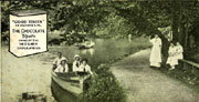
Illustration #15A
Original Hershey
postcard like the one
that Duchamp purchased, 1910’s
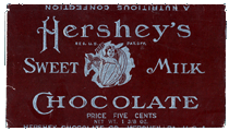
Illustration #15B
Original Hershey
chocolate wrapper
that held postcards, 1910’s
Illustration #15C
Three Hershey post
cards done in a series
5. Duchamp’s Underwood typewriter cover (1916)
click to enlarge
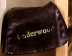
Illustration #16A
Marcel Duchamp, miniature
version of Traveler’s Folding
Item in his Boite-en-Valise, 1941
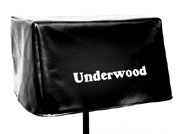
Illustration #16B
Marcel Duchamp, Traveler’s
Folding Item, Schwarz
edition, 1964
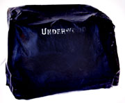
Illustration #16C
Rare, original Underwood
typewriter cover ca 1915
One of Duchamp’s strangest readymades has to be his Underwood typewriter cover (1916). The first time that we see either an object or a depiction of this alleged readymade is in 1941, when Duchamp created a miniature version for his Boîte-en-Valise (see illustration 16A). Duchamp’s only other extant version was created late in his 1964 Schwarz edition — twelve copies of a full scale Underwood typewriter cover that looks, and is sized, more more like the cover for a barbeque grill than for a vintage typewriter (see illustration 16B). No photograph, or any other type of 2-D or 3-D representation, exists of Duchamp’s readymade rubber Underwood cover (1916).
Finding a circa 1916 typewriter (as indicated by dating serial numbers of Underwood #5 models) was easy. But we encountered quite a problem in trying to find an intact rubber cover from the same period. Collectors or museums either did not think it important to save them, or the covers themselves had been discarded because of deterioration. I was lucky to find our rare, near perfect example. Calls to experts and museums throughout the country led to a collector who, to our good fortune, had bought an Underwood #5 with the correct serial number (from circa 1916) that had never been opened or removed from its original wooden crate. Happily, he was willing to sell us the rubber cover for our collection. (see illustration #16C)
click to enlarge
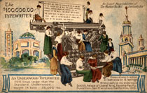
Illustration fon #17A
Postcard depicting Giant
Underwood typewriter
(1728 times larger
than the standard
Underwood Model), 1915
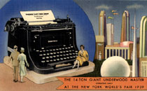
Illustration #17B
Postcard of the
14-ton Underwood
Master At The New
York World’s
Fair, 1939
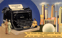
Illustration #17C
Postcard of the
14-ton Underwood
Master At The New
York World’s
Fair, 1940
Duchamp’s first version of his Underwood cover in 1941 probably relates to a highly popular 14 ton giant Underwood typewriter, (11) which was first displayed in the 1915 Pan American Exhibition and later in 1915 in Atlantic City, New Jersey as a permanent exhibition until it was reconditioned and updated for display at the 1939-40 World’s Fair in New York. Note the beautiful girls sitting on typewriter keys depicted on both Pan American (1915) and World’s Fair postcards (1939-40) in illustrations 17A, B, and C. What a crazy country, Duchamp perhaps thought — where you can find beautiful girls to marry in chocolate bars and watch them dance on giant working typewriters!(12) Illustration 18A shows Duchamp’s 1941 miniature typewriter cover with a miniature model of the 14 ton giant typewriter that worked as a bank and was sold at the 1939-40 New York World’s Fair. Duchamp often expressed his interest in optical illusions between “doll size” and full size objects. (Without an explicit indication of scale cues one cannot tell a miniature from a normal sized object in a presentation such as a postcard photograph). The relationship of the miniature Underwood bank to the famous 14 ton giant typewriter, as well as the display of the giant in 1939-40, suggests its inspiration for Duchamp’s 1941 miniature version. (13) (Sapolin advertising also included giant and doll sized versions of signs that Duchamp could have easily seen — see illustration 18B and C.)
click to enlarge
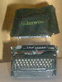
Illustration #18A
Miniature version of
Duchamp’s Underwood cover
from 1941 Boite-en-Valise
along side a New York
World’s Fair miniature
bank with its box pictured
above
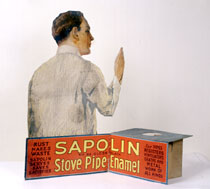
Illustration #18B
Large size version of
Sapolin sign showing a
man painting 32 1/8
x 32 7/8”
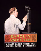
Illustration #18C
Small size version of
Sapolin sign showing
same man painting 6 1/2x 8”
6. Duchamp’s 50cc.of Paris Air (1919) medical glass ampule
Here we encounter another excellent case of the historical record not supporting Duchamp’s claim that his readymade object is a mass-produced, easily store-bought object. Duchamp’s alleged medical glass ampule (1919) is oddly titled 50cc. of Paris Air. But the similarly sized glass of 1964 (one of the Schwarz editions of 14 in our collection) measures approximately 125cc. Duchamp claimed that he opened a standard glass medical ampule purchased at a pharmacy (at a non-existent address of parallel streets that he described as a corner). After emptying it, Duchamp said that he asked the pharmacist to reseal it, thus trapping the air of Paris inside (see illustration 19).
click to enlarge
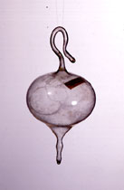
Illustration #19
Marcel Duchamp, 50cc
of Paris Air, 1919
No duplicate ampule was
ever found “mass-produced”
and “readymade” despite
Duchamp’s claim
We have collected numerous examples of medical glass ampules (circa early 20th century) from the US and across Europe (see illustration 20A, B and C). Our collection permits comparison of the typical shapes of mass-produced ampules, with their cylinder forms for easy and safe packing into rows, with Duchamp’s impractical miniature ampule from his 1941 Boîte-en-Valise. (We measured the volume of our miniature 1941 version of 50cc. of Paris Air shown here in illustration 20D and found the capacity to be approximately 35cc. despite the title). (14)
click to enlarge
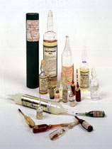
Illustration #20A
Our ampule collection
illustrates that Duchamp’s
50cc of Paris Air,
1919 and his miniature
are historical anomalies.
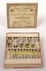
Illustration #20B
Box of ampoules from
Milan, early 20th century
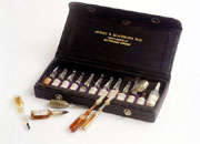
Illustration #20C
Box of ampoules,
early 20th century
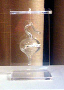
Illustration #20D
Marcel Duchamp, miniature
version of 50cc of Paris
Air for the Boite-en-Valise,
1941, is unlike any mass
produced ampule in our collection
Illustration #22
Jantzen rubber bathing
cap, 1920’s style
7. Duchamp’s
bathing cap work, Sculpture for Traveling (1918)
Once again we have another case where no published photograph illustrates this original 1918 in its detailed and completed form. Only a 1941 retouched, hand colorized print, included in his Boîte-en-Valise and two studio photographs, exist to buttress Duchamp’s story that he took various colors of rubber bathing caps, cut them up and tied them together with string, as reproduced in illustration #21A, B,and C.
We have acquired a rare yellow Jantzen rubber bathing cap (circa 1920’s style) with its textured surface and molded shape typical of a product that has now disappeared from the market place but was then (1918) in fashion. One needs the bathing cap as reference to correctly imagine and reconstruct this important 1918 proto-installation work, see
click to enlarge
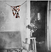
Illustration #21A
Marcel Duchamp, retouched
reproduction of Sculpture
for Traveling,
Boite-en-Valise, 1941
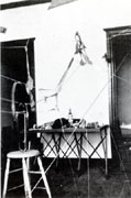
Illustration #21B
Marcel Duchamp, Sculpture
for Traveling is included in a studio
photograph, 1918
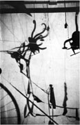
Illustration #21C
Marcel Duchamp, Ombres
Portées (Cast Shadows),
1918, also shows
sections of Sculpture
for Traveling
Conclusion
The aforementioned examples represent only a few cases among the many that I could have discussed. I have argued that, in Duchamp’s work, the historical context is vital to scholarly research and understanding, and therefore requires a collection parallel to the actual, objectively valuable art works. Cross-disciplinary studies have long been defended in principle, but rarely in practice, as an idealized vision for scholarship. Collections parallel to collections of art objects, consisting of historical objects relevant to specific works, historical records such as books, catalogues or patents and other ephemera and letters, promise not only preservation of our cultural heritage but also an active matrix for cross-disciplinary research in the arts (see graph A and B). In contrast to the parallel collections in graph A, graph B shows the junctions of the general with the particular. Make intersections between the two collections and your work becomes literally cross-disciplinary, and extendable in many directions. X marks the spot for the future of scholarship, where culture and objects meet for active education and learning, not static storage and display in libraries and art museums.
click images to enlarge
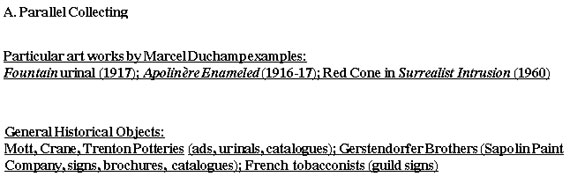
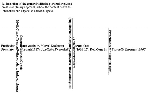
Graph A
Graph B
Notes
1. Duchamp falsely claimed and the public mistakenly believed that he was only “breathing and playing chess” and that he had not been making art since 1923.
2. See brochure on exhibition; “Eau & Gaz A Tou Les Étages: La Dation Alexina Duchamp”, 29 May – 5 June, 2000, Centre Pompidou, Musée national d’art moderne, centre de création industrielle.
3. Duchamp scholar William Camfield discusses his failed search for a duplicate urinal. He was the first to speculate that perhaps none exists (William A. Camfield, Marcel Duchamp: Fountain, The Menil Collection Houston Fine Art Press, 1989). Moreover, Kirk Varnedoe testifies as to how his team of researchers also failed to find exact duplicates of any Duchamp “readymade” in the historical record (see Rhonda Roland Shearer “Marcel Duchamp’s Impossible Bed and Other “Not” Readmade Objects: A Possible Route of Influence From Art to Science,” Part I and II, Art & Academe, Vol. 10, No. 1 & 2, Fall 1997 and Spring 1998). My research reveals that plumbing pottery manufacturers so infrequently altered any of their standard toilet, urinal, bath tub or other products that none had a full time modeler, see book by Arhcibald M. Maddock, II, The Polished Earth: A History of the Pottery Plumbing Fixture Industry in the United States, Trenton, New Jersey, 1962.
4. The premise and rules of the exhibition stated that any artist would be free to exhibit any work, unjuried, as long as they paid the entry fee. Duchamp’s urinal (signed and submitted by his alias “R. Mutt”) rawly exposed his fellow artists’ pretenses and hypocrisy.
5. Greg Alvarez’s and my analysis of these urinals indicates that the two photographs of Duchamp’s studio which include urinals are showing Bedfordshire urinal types — dissimilar in form from Duchamp’s 1917 Stieglitz urinal. Therefore, Duchamp’s studio photographs show a different urinal from the one represented in the 1917 Stieglitz photo.
6. Note that Duchamp altered the letters “manufactured by Gerstendorfer Bros.” to what had been generally believed to be a nonsense statement. Stephen Jay Gould and I, along with André Gervais, are preparing an essay with an alternative interpretation and analysis.
7. The only two exceptions are formal framed portraits of Presidents of the United States.
8. Duchamp’s friend and expert on his works, Arturo Schwarz and other scholars support the belief that this note was written by Duchamp. We are pursuing further forensic analysis by hand-writing experts. In addition, Hector Obalk’s opinion as an expert on Duchamp’s writings states that “the writing is not inconsistent with Duchamp’s handwriting.” (interview with the author, July 2000)
9. See my article, Duchamp’s Impossible Bed, in footnote no. 3 above.
10. I am grateful to Francis Naumann who reported to me that he had purchased this Hershey postcard himself.
11. I am grateful to Ecke Bonk who first informed me about the 14 ton giant Underwood typewriter (depicted with women) at the 1939-40 New York World’s Fair.
12. Underwood typewriters were frequently in the press with advertising and news stories about typing contests and awards, typing speed champions as well as blindfolded typing competitions. We have examples of these ads in our collection.
13. See article in Scientific America (Vol. CXII. No. 9, Feburary 27, 1915, p. 202), also in our collection.
14. Unlike the 1919 version of 50cc. of Paris Air, Duchamp tells us where he had the 1941 version custom made in Paris.